This blog highlights healthcare data exploration with Tableau’s visualization techniques. We will learn how it presents an integrated view and evidence for making healthcare decisions.
According to Statista, the amount of healthcare data generated by the end of 2020, had increased to the colossal amount of 2,314 exabytes.
Big data analysis is booming in every industry. Similarly, modernization and achieving data are key imperatives in healthcare. Visualization provides an intuitive way to present and understand user data.
Tableau helped the healthcare sector to optimize challenges such as during the COVID-19 crisis and pushed healthcare professionals to be more predictive in how they use their resources going forward.
Data visualization objective in healthcare
Medical institutes deal with big data regularly. They require extensive data handling support to interpret information and understand its implications. You must have seen the patient’s heartbeat visualization in tv series and dramas. That is one example of how significant it is to visually realize the dataset for everyone.
Moreover, it improves the management’s decisions on healthcare policies and services by presenting an integrated view and evidence to take healthcare decisions.

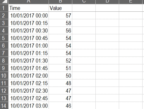
It is indeed challenging to figure out a meaningful conclusion from the above data set. Even for a medical professional, it gets tedious to read complicated data.
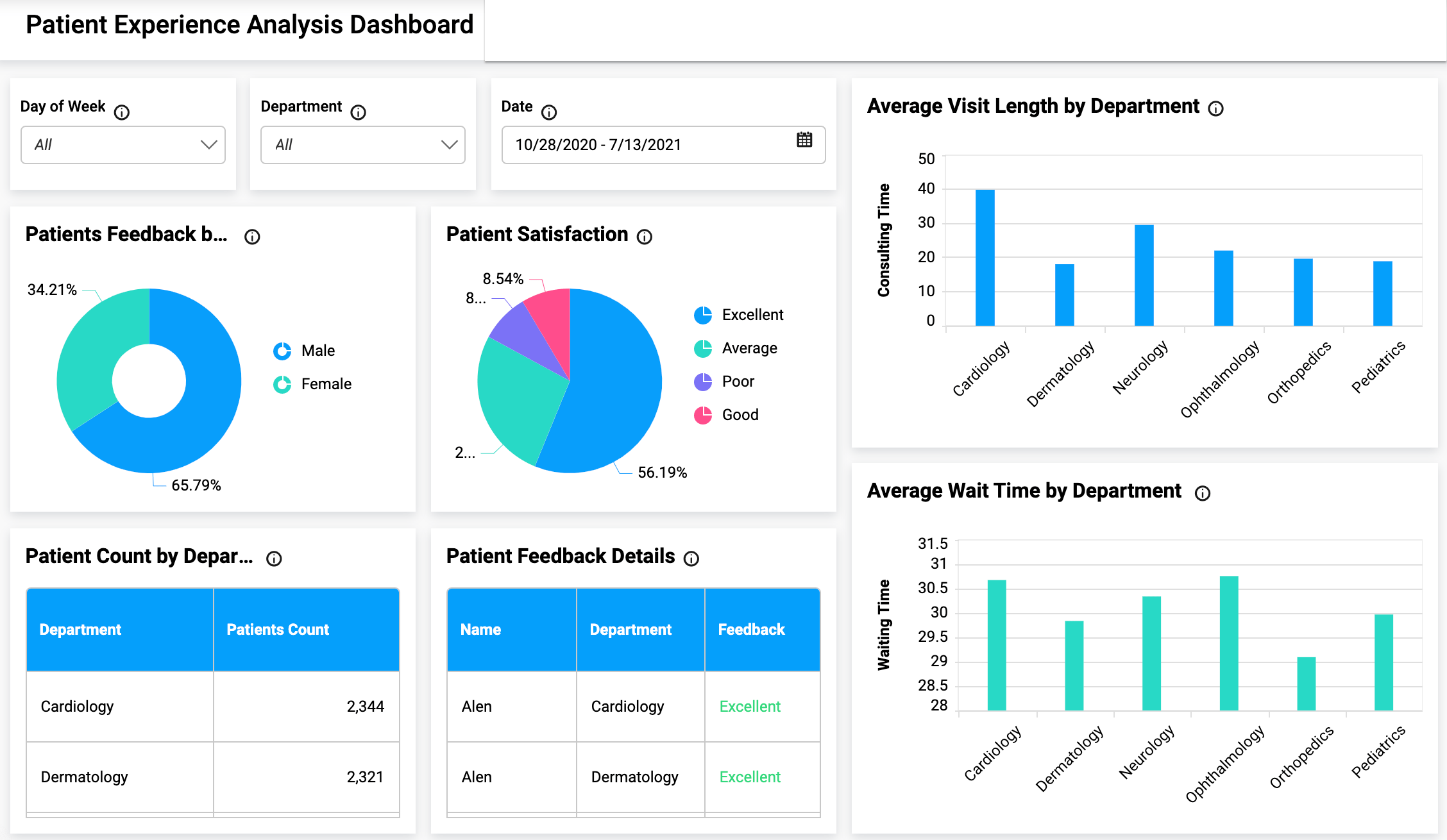
In that case, how is data visualization used in healthcare? Data visualization eases the data reading task for medical assistants by simplifying the datasets. It transforms and then visually displays medical data points that synthesize the analysis of data points. As a result, it gets easier to process, visualize, and understand for the layman as well.
Watch this event, we will cover how to design a dashboard and more in Tableau. This crash course is intended for beginners. By the end of the session, you will know:
Crash course on designing a dashboard in Tableau
It is important for healthcare because it can help to identify patterns, trends, and correlations between different types of data. Data visualization can also be used to make complex information easier to understand, which helps improve the quality of care.
The upward trend of data gathered globally by healthcare professionals shows the need for advanced visualization tools to analyze and explore more efficiently.
Use of data visualization tools for clinical assessment

To develop high-quality visualizations, healthcare organizations will require open-source and commercial data visualization libraries, as well as open-source libraries. They will also benefit from the ability to render data sets with high performance.
Powerful data visualization libraries:
There are several differences between the open-source and commercial data visualization libraries. Numerous open-source libraries are available to the public. These libraries provide simple, but effective data exploration.
However, several commercial libraries are capable of processing data in real-time and can render hundreds of thousands of data points in a single render. Healthcare organizations must be prepared to visualize all of their data to create high-quality visualizations at a rapid render.
Rendering performances:
These are available in several languages, including JavaScript, Python, and, NET. The libraries’ purposes and rendering capabilities vary. Open-source libraries are constrained in resources and perform poorly, while commercial libraries are there to resolve that issue and can render millions of data points in real-time without problems.
Resource optimization:
The healthcare sector is committed to visualizing all its data, but is it fully prepared? It is preparing for and using GPU-accelerated libraries to deliver higher-quality visualizations at a faster render time, regardless of the health sector’s computing power.
Using Tableau to manage health data exploration
Tableau connects users with a variety of data sources and enables them to create data visualizations by making charts, maps, dashboards, and stories through a simple drag-and-drop interface. It is possible to create a simple view to explore sample data using Tableau for beginners.
It offers several visualization techniques including tables, maps, bar charts, heatmaps, tree maps, line charts, bubble charts, etc. Often, we require customizations in data, such as radar charts with user intention. In this scenario, it allows the users to create interactive visualizations and add engaging views to express the desired format using filters, drop-down lists, calculated fields so on.
Read this blog to learn about how data science benefits healthcare systems
Features offered by Tableau for healthcare professionals
Let’s shed some light on the core healthcare features offered by Tableau to help medical institutes.
Payer analysis:
The data about payers’ operations, plans, and claims provided by healthcare payer analytics are used to derive insights into current healthcare patterns. Also, payer analytics software drives optimal patient experiences and provides doctors with data-driven care outcomes by using the world’s leading healthcare analytics platform
Provider analytics:
A provider data analysis monitors payment for services rendered in a facility, such as a hospital or skilled nursing facility, to ensure that duplicate payments are not being made through both a facility and professional claim submission for the same service.
Medical device analytics:
Optimize virtual sales, improve supply chain management, and realize end-to-end business transformation with the world’s leading analytics platform. It allows health institutes to visualize patient journeys over time.
Benefits of Tableau in different industries
Tableau is a data visualization software that is used to create interactive, informative, and data-driven graphs. The software has multiple features that make it an ideal tool for visualizing different types of data.
Tableau has been used by various industries including healthcare, finance, and retail. It’s also being used in the entertainment industry to visualize statistics about movies and TV shows.
Tableau helps organizations with big data problems by making it easy to work with large amounts of information. It provides a way for people to find insights into their data without having any programming skills or knowledge of SQL.
This makes it an ideal tool for people who want to explore their data on their own without having to rely on IT experts or developers all the time. Tableau also provides a good way for companies to share their insights by making visualizations public.


