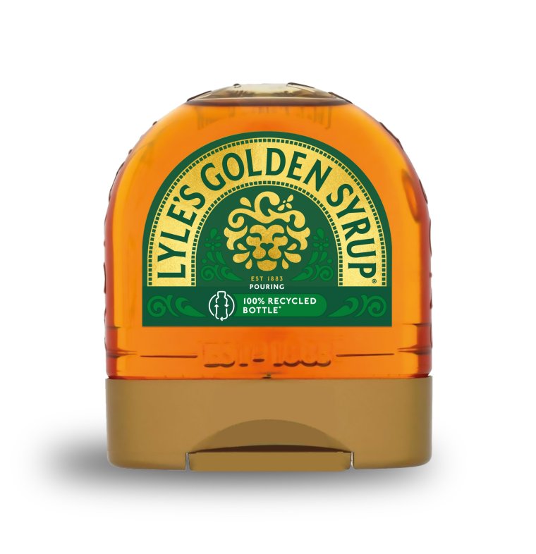
Lyle’s Golden Syrup has been a constant feature of food shelves across the UK since Victorian times, its distinct deceased lion logo sought out by sweet-toothed customers.
But now the slain carnivore is about to be resurrected in a 21st century facelift.
First launched in 1881, Lyle’s has been sold in the same green and gold packaging since 1883 complete with the logo, which shows the recumbent feline surrounded by hungry bees.
In fact, the product holds the Guinness World Record for the oldest unchanged brand packaging.
However, after more than 140 years, the lion is getting a new lease of life and will be raised from the dead, to appear as a happier creature, with just one bee for company.
What was the old Lyle’s Golden Syrup logo?
The original logo was the idea of the product’s founder, Scottish businessman Abram Lyle.
A man of strong religious beliefs, he chose an image from the Old Testament for his refined sugar syrup – the lion killed by biblical strongman Samson surrounded by a swam of bees.
Samson is said to have overcome the fierce beast with his bare hands, and then returned to the dead creature at a later date to find a swarm of bees had built a hive inside the carcass.
The Bible says he took the honey from the hive and fed it to his parents without telling them from where it came.
Then at a wedding party he asked guests to solve a riddle relating to the honey’s origin: “Out of the eater, something to eat; out of the strong, something sweet.”
Lyle took this riddle and created his own version for the golden syrup – “Out of the strong came forth sweetness” – and the Golden Syrup’s branding was born.

Why is the logo changing?
Now, however the lion is being reborn on most of Lyle’s golden syrup products – excluding the classic tin, which will retain the original illustration.
In place of the dead lion and swarm of bees, there is a a smiley lion’s face with just one bee.
James Whiteley, brand director for Lyle’s Golden Syrup, said: “We’re excited to unveil a fresh redesign for the Lyle’s Golden Syrup brand.
“While we’ll continue to honour our original branding with the heritage tin, consumers need to see brands moving with the times and meeting their current needs.
“Our fresh, contemporary design brings Lyle’s into the modern day, appealing to the everyday British household while still feeling nostalgic and authentically Lyle’s.
“We’re confident that the fresh new design will make it easier for consumers to discover Lyle’s as an affordable, everyday treat, while re-establishing the brand as the go-to syrup for the modern UK family, featuring the same delicious taste that makes you feel Absolutely Golden.”
But the lion’s renaissance has not been met with unfettered joy.
Helen Edwards, adjunct associate professor of marketing at London Business School, told the BBC that although the rebrand would help to reduce the risk of excluding some buyers, it may also lose its place as a familiar and favourite grocery item.
“The story of it coming from religious belief could put the brand in an exclusionary space, especially if it was to go viral on X or TikTok,” she said “But hanging on to some of the original branding is a good idea as people tend to remember brands through visual codes – the green colour, the lion – which remind people, ‘That’s the product I buy, that’s the one I like.'”
Robert Bargery, executive director of the Royal Fine Art Commission Trust, told MailOnline: “A successful brand with a solid reputation probably has more to lose than gain by going for a new logo.
“The redrawn lion is so stylised as to lack clarity at first glance, whereas the old lion is clearly a lion: it is what it looks like on the tin.
“But who knows, Golden Syrup may soon be as stigmatised as cigarettes, so the lively rebrand of a dead lion may excite a sugar-rush among the avocado-on-toast generation.”


'President Musk' is flexing his muscles and revealing how weak Trump is