Complementary Colors in Photography

Photography, as the name suggests, is the process of creating images with light. But if you use only light, the entire image will be pure white (or any other color). So we also need the absence of light, or shadows, to create and showcase what we want. It’s the interplay between light and shadows that creates the final image.
The colors in a photograph are the first thing that catches the viewer’s attention, and they can make or break the image. If you go shooting outside on a dull day and there is not much color going on, it could even be a good idea to convert the picture into black and white or monochrome so that the viewer focuses more on the composition and doesn’t get distracted by the dull lack of colors.
Color theory is therefore important to learn alongside composition. It works for any and all types of images, be it portraits, landscapes, or any other category. One of the most widely used color schemes by photographers is the complementary color scheme.
In this article, we will explore what complementary colors are and how you as a photographer can use the concept to capture compelling color photos that grab your viewers’ attention.
Table of Contents
An Introduction to the Color Wheel
Color theory in essence is the interaction of various colors, and this interaction is often represented by what is known as the color wheel.

We use a color wheel to define colors and their relationships to one another. The colors on the trichromatic color wheel model are divided into three broad categories.
- Primary Colors. Red, Yellow, and Blue. All other colors in the color wheel can be made from the mixing of these three hues.
- Secondary Colors. Violet, Orange, and Green. These colors are created by mixing equal parts of two primary colors.
- Tertiary Colors. Blue-Violet, Red-Violet, Red-Orange, Yellow-Orange, Yellow-Green, and Blue-Green. These colors are created by mixing equal parts of a primary and secondary color.
Note: The trichromatic color wheel model can also have the primary colors of red, green, and blue, which are known as the additive primary colors. This article includes some additive color wheels as well, but the discussion and examples will largely focus on the classic color wheel based on the subtractive primary colors of red, blue, and yellow. Complementary color pairings under the RGB primary colors are different, but the concept of complementary colors remains the same for both color wheels.
One of the best resources to see and understand the color wheel is Adobe Color, which offers an interactive color wheel and a color palette generator.

Color Harmonies and Schemes
Once we understand the color wheel we can focus on color harmonies in the wheel. Color harmony refers to aesthetically pleasing and harmonious color combinations based on the geometric relationships on the color wheel.
Let’s take a look at various color harmonies in brief.
Monochromatic. A single hue on the color wheel that includes various tonal values of the color. It brings attention to the light and form and is visually cohesive. The color chosen impacts the mood. Most of the time it’s not always true monochromatic.

Analogous. A group of colors that lie adjacent to each other on the color wheel. These colors are often found in nature and can feel harmonious and serene. These can be created during twilight scenes, during blue hour, or in areas that are predominantly one color family (eg. forests).

Triadic: A group of three colors equally spaced around the color wheel. This color harmony generally conveys a cheerful and lively mood.

Diadic. A group of two colors that are separated by two hues on the color wheel. This type of combination is generally created in post-processing or by using artificial lights since it’s not easily found in natural settings.

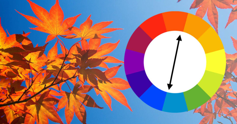
Complementary: The last and one of the most popular color harmonies is the complementary color. This is a combination of colors on the color wheel that lie directly across from each other.

It is this complementary color scheme that we are focusing on in this article. This is a high color contrast combination that adds vibrancy and energy to the image. It helps to pop out the subject in the image especially if the background is chaotic.
It’s more useful when the subject is already standing out from the background (in cases when the background is blurry) and the color contrast makes it even more evident.
The Power of Complementary Colors
Complementary colors, which are also called “opposite” colors, can be widely found in both nature and in the creative world. The opposing nature of the colors provides the strongest possible contrast for each of the two colors, and the result is a feeling of boldness, loudness, and energy.
The unique nature of complementary colors has been observed and used in art since antiquity. They can often be seen in the works of master painters.

Complementary colors are also widely used in Hollywood movies. Orange and teal, in particular, are ubiquitous in providing a “Hollywood look” to blockbuster films.

When used effectively in art and photography, complementary colors can be used to draw a viewer’s attention to a certain subject or section in a scene.
Examples of Complementary Colors in Photos


Shooting Photos with Complementary Colors
Here are some tips for using complementary colors in your photography.
1. Use white balance as a tool. One way to emphasize or add to color contrasts is by using a particular white balance setting either in camera (if you are shooting JPEG) or in post-production (whether you are shooting JPEG or raw). The choice of white balance (at least for non-color accurate photography like product photography, etc.) is purely creative. For scenes or subjects with complementary color schemes, creative white balance is usually important.

2. Look for mixed lighting environments. In mixed lighting situations, complementary colors are often created: for example, at sunset, light-illuminated parts of the scene will appear warmer than shadowed parts of the scene (which are illuminated primarily by light reflecting from the blue sky above, and therefore seem relatively cool). The complementary color scheme will be destroyed if you “correct” the white balance to correct for blue light in the shadows. One should try to find scenes that have natural complementary colors

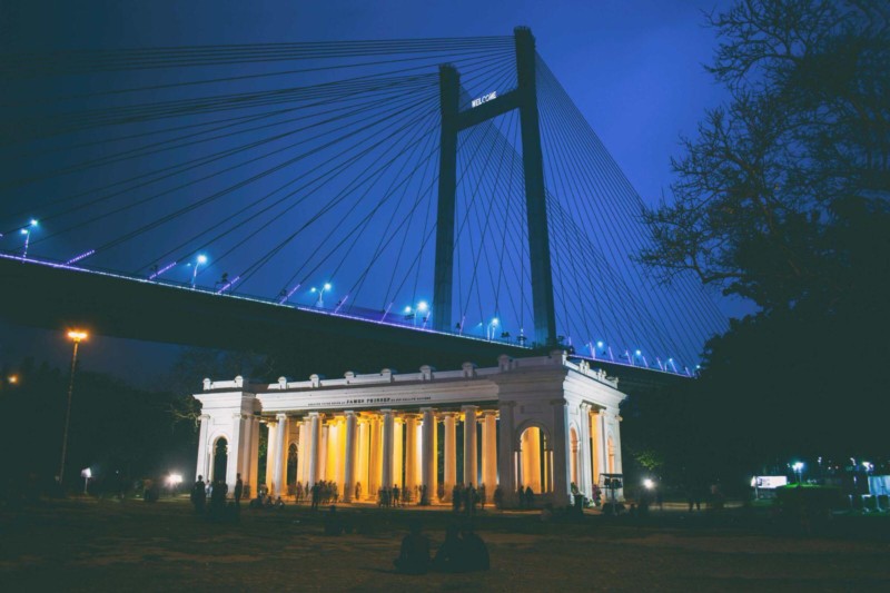
This photo taken during the blue hour depicts the contrast between the blue sky and the yellow artificial lights. It helps to visually separate the building from the bridge in the background. The most vibrant shades of complementary colors provide the highest or the most striking contrast. But that is not always what you might want aesthetically as in the above photo.
3. Use one of the colors as the accent color. Sometimes you don’t want such high contrast. You then need to balance between a visually energetic photo and a vibrant one.
You can go for a more balanced, natural look. To make the design less overwhelming, tone down one or both colors.

The red jets stand out in a blue sky because the two colors complement each other and create a strong contrast.
4. Find or introduce complementary colors for your background or subject. You should keep an eye out for compositions where you can easily incorporate complementary colors. If you are indoors, try looking for backgrounds that complement your subject, either depending on the outfit color if it’s a person or the actual color if it’s an object that you are shooting.
When you have the ability to introduce colors into your scene — being able to choose the outfit on your subject, for example — keeping complementary colors in mind can be a great way to add some “pop” to your image.
5. Keep your eyes open when out in nature. It’s often easier to create complementary color combinations than other combinations since these are comparatively easier to find in nature. If you are shooting outside you should be on the lookout for natural phenomena like the sunrise or sunset which gives the perfect opportunity to capture complementary colors. You should pay special attention to the changing colors as the sun travels across the horizon during sunrise and sunset and the changing hues from oranges and pink to blue twilight.
6. Use complementary colors to convey emotions. You should try to link the color combination that you are using to the emotion being conveyed in the picture. It may be due to societal reasons or personal experiences, but certain colors resonate with people in particular ways. This is something to keep in mind as you look for complementary color combinations.
Here are emotions associated with common complementary color combinations:
- Red-Green: Love, healing, energy, freshness, energy, growth, excitement, life.
- Orange-Blue: Success, trust, confidence, peace, bravery, loyalty, optimistic, freedom.
- Yellow-Purple: Creativity, royalty, happiness, luxury, warmth, ambition, cheerful, spirituality.
7. Use a split complementary color scheme. It’s always not necessary that you will have exactly two color pallets in your photo. If you want you can even go for a split complementary scheme wherein you choose your main color, and then use it with the two colors directly on either side of its complementary color on the color wheel.

A complex version and a step up would be tetradic color harmony wherein you use two complementary pairs.

Consider complementary color schemes whenever possible. You can create colorful and exciting photographs by juxtaposing opposites of colors.
Image credits: Header illustration based on photo by Umberto Nicoletti and licensed under CC BY-SA 2.0.


