5 best practices for your survey results presentation: A guide for consultants, HR professionals, marketers and more

In today’s business world, understanding your customers is crucial. Collecting data can be challenging, but turning that data into useful information or representative statistics is a whole different game. 

Well, a picture is worth a thousand words. The best technique for understanding any assessment or survey results is to visualize them.  In this article, we’ll look at the top 5 ways to effectively present your assessment or survey results:

Psst. Want to dive straight into creating questionnaires with advanced and automated report generation? Find out if our software is what you’re looking for.

1. Using charts for survey results presentation at one glance

A chart or graph is a visual presentation of data. The major goal of using charts is to display your assessment or survey results in a meaningful way.

Good charts convey information easily and quickly to the audience, whereas a bad chart leaves you confused. They highlight the salient characteristics of the assessment results and deliver a convenient method to compare different sets of it. Whether you want to show a relationship, highlight a trend, or make a comparison, charts help the users in understanding what you’re talking about.

Have a look at the images below of both good charts and bad charts.

Good chart: precise and clear
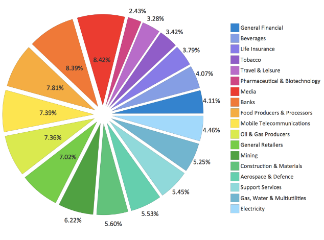
Example of an effective pie chart with many variables

Bad chart: confusing and unclear

Example of a confusing bar chart

There are several chart types such as bar graph, line graph, Venn diagram, pie chart, and more. Different situations require different chart types for a simple and clear presentation of the assessment or survey assessment results you’ve collected. For this, you need to pick the chart that best fits your situation.

You can display your charts in these business presentation examples, helping you craft engaging and persuasive presentations for various purposes, from sales pitches to corporate meetings.

Bar graph

Bar charts are a type of graph used to display and compare the number, frequency, or other measures for different discrete categories of data.

Bar charts are one of the most commonly used types of graphs because they are simple to create and very easy to interpret. They are also a flexible chart type and there are several variations of the standard bar chart including horizontal bar charts, grouped or component charts, and stacked bar charts.

Bar graphs are best used to compare things between different groups or to track changes over time. However, when trying to measure change over time, bar graphs are best when the changes are larger.
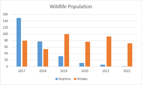
Example of a double column chart

Line graph

Line graphs are usually used to show time-series data – that is how one or more variables vary over a period of time.

Line graphs are particularly useful for identifying patterns and trends in the data such as seasonal effects, large changes, and turning points. As well as time-series data, line graphs can also be appropriate for displaying data that are measured over other continuous variables such as distance.

For example, a line graph could be used to show how pollution levels vary with increasing distance from a source, or how the level of a chemical varies with the depth of soil. However, it is important to consider whether the data have been collected at sufficiently regular intervals so that estimates made for a point lying halfway along the line between two successive measurements would be reasonable. In a line graph, the x-axis represents the continuous variable (for example year or distance) whilst the y-axis has a scale and indicates the measurement. Several data series can be plotted on the same line chart and this is particularly useful for analyzing and comparing trends

Typical examples of the types of data that can be presented using line graphs are monthly rainfall and annual unemployment rates.
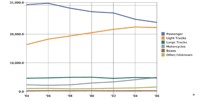
Example of a line graph

Venn diagram

A Venn diagram (also called primary diagram, set diagram, or logic diagram) is used to show all possible logical relations between different sets. This diagram uses overlapping shapes, often circles to illustrate the logical relationships between two or more sets of items.

You can use Canva’s free Venn diagram maker to create your own Venn diagram.

For example, say you have three characteristics, you can present them as follows:
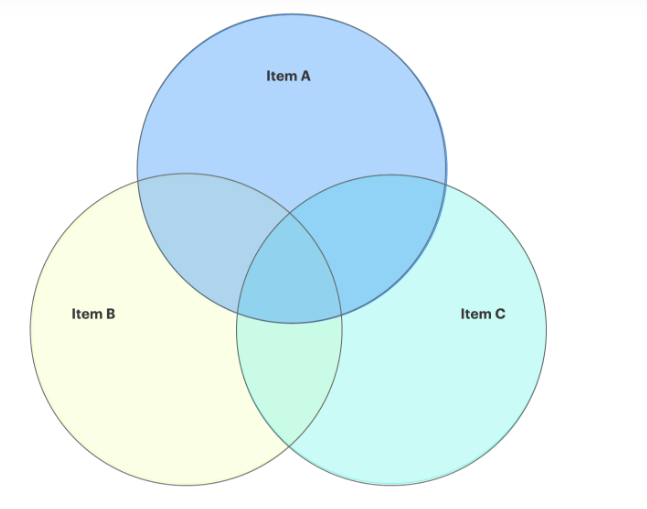
Example of a Venn Diagram that consists of 3 rings

Pie chart

This is one of the popular types of charts out there. These are used to comparing parts. Each arc is delineated by building outspread lines from its closures to the focal point of the circle, making wedge-formed “slices”. The sum of all slices is always 100%.
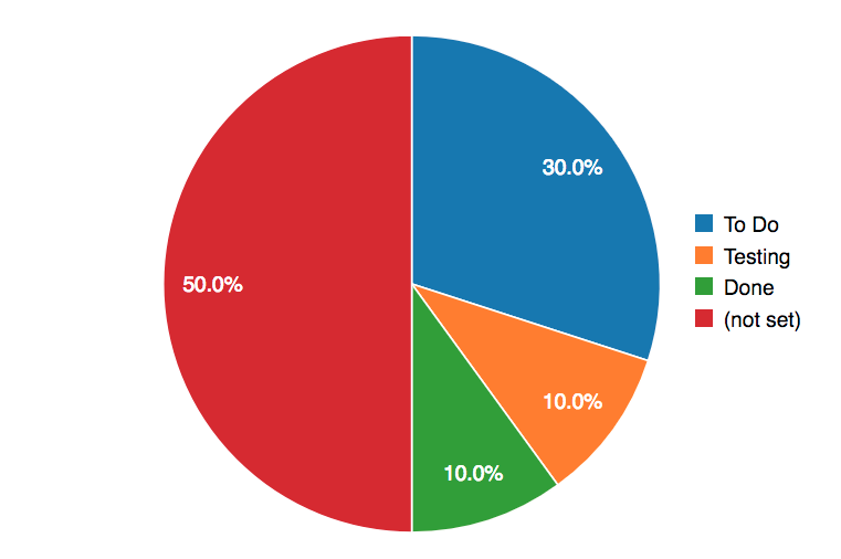
Example of a pie chart with four different colors

2. Video infographics to animate your survey results presentation
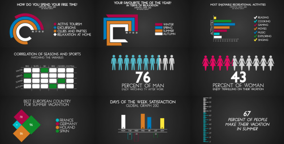
Example of video animation for a survey results presentation

Video infographics or animated infographics are another way to present your statistics.

Video infographics are created by combining different animations in one informational video. It helps you in explaining assessment or survey results in an engaging manner.

It can add an extra dimension of excitement and provide a brief overview of your business data.

Apart from this, visual infographics offer an effective communication source capable of conveying concrete and complex information effortlessly. If you have a killer video infographic idea, it allows you to create a video infographic for your business using a video-making tool. 

From several online video-making tools available, you can take help from Renderforest. It is a free video-making platform that helps you in building promotional videos, slideshows, intros, special events videos, and more within minutes. Use Renderforest as an affordable, fast, and easy-to-use tool to make video infographics and to present your survey results in a more understanding and attractive way.

3. Infographics to summarize and tell a visual story

Infographics are another great way to share your business statistics with your audience. Survey results are easily translated into graphs and charts, making survey results and infographics the perfect couple.

Infographics are not only eye-catching, but they also make your business data look more pleasing and impactful. There are a number of examples of statistical infographics that have gone viral in the industry.

For example, Bill Gates’ World’s Deadliest Animal Infographic.
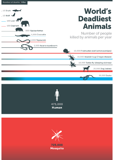
Example of for a survey results presentation

A strong infographic will leave an unforgettable impression on your audience. You can also take the idea from this chart and create something outside-the-box. The best thing about infographics is that they are easy to design and anyone can create them, even without a designing background.

Our friends over at Venngage have written a great article on turning survey results into an infographic.

4. Data visualization

One of the best ways to interpret the statistics is to visualize the numbers as an image. This can help you to see a pattern that is otherwise not visible. 

To present your survey results, a visual representation can promote your message and shows statistical information. It can be in the form of diagrams, tables or graphs. Excel makes it incredibly quick and simple to edit all aspects of a graph and because it’s so widely used. If you’re not experienced with Excel it’s easy to find training programs to get you up to speed.

Have a look at the column chart:
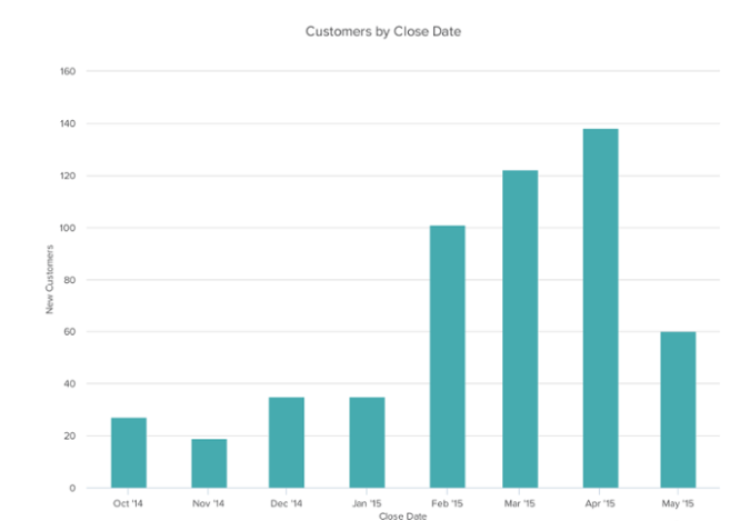
Visual of a colored column chart for survey results presentation

Remember, for readers visual representations are easy to understand. Statistics presented in the form of visuals can be easily understood compared to long list of numbers. The visual presentation illustrates current trends quickly and is an efficient way to transfer the database information into the reader’s mind.

It is also important to keep in mind that poor visualization of statistics can often be misleading. Therefore, to balance function and design is very essential. Visuals that are complex fail to communicate with the audience. Misleading information can also be an outcome of distinctive cultural traditions. For instance, colors might hold different symbolic meanings globally.

5. Turning your data in full-blown presentations

Last but not least presentations. Data can only work if it is understandable to your audience.

The best way to decipher a jumble of numbers, data, and statistics is by turning it into a visual presentation. Have you ever used a presentation maker for presenting your business statistics? If no, try this now. It is an efficient and famous method to get your message across your potential audience effectively.
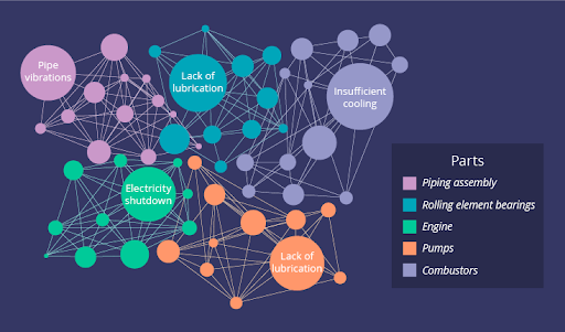
Example of data visualization

Creating a data visualization presentation is in itself an art. You need to take into consideration various factors e.g., the type of data you would like to share and the medium for your data, while aligning with design trends to ensure your presentation is modern and impactful.

By analyzing your data and selecting a medium, you can design an effective presentation to represent your data. Also, you need to ensure that the presentations you’re creating must be of high quality and engaging to the visitors. Once you’ve presented your survey results using these effective methods, don’t forget to provide feedback channels for your audience to share their thoughts and insights. Your audience’s feedback can help you refine your presentation techniques and better meet their information needs.

Always keep in mind that there is a story behind every statistic, and a data visualization presentation can help you in depicting that story successfully.

Final words

Graphs, diagrams, and tables are all great and attractive ways to present survey results that are easy to understand. The major reason for using visuals is clarity as some data can be better understood when explained visually. And when it comes to presenting data, nothing is more effective than a table or graph. Add your logo to your presentation and you have a professionally branded survey report.

How to build automated survey reports with Pointerpro

Here’s a quick introduction on how Pointerpro works, brought to you by one of our product Experts, Chris.

This is what clients say about us:

Create your
own assessment
for free!

Create your
own assessment
for free!

About the author:
Roman Daneghyan

Roman Daneghyan

Roman Daneghyan is Chief Marketing Officer at Renderforest, specializing in social media marketing, content marketing, and SEO.

One Response

Want to know more?
Subscribe to our newsletter and get hand-picked articles directly to your inbox
  翻译: