Google really whiffed with the new logos for its “reimagination” of G Suite as Google Workspace, replacing icons that are familiar, recognizable, and in Gmail’s case iconic if you will, with little rainbow blobs that everyone will now struggle to tell apart in their tabs. Companies always talk loud and long about their design language and choices, so as an antidote I thought I’d just explain why these new ones are bad and probably won’t last.
First I should say that I understand Google’s intent here, to unify the visual language of the various apps in its suite. That can be important, especially with a company like Google, which abandons apps, services, design languages, and other things like ballast out of a sinking hot air balloon (a remarkably apt comparison, in fact).
We’ve seen so many Google icon languages over the years that it’s hard to bring oneself to care about new ones. To paraphrase Sun Tzu, if you wait long enough by the river, the bodies of your favorite Google products will float by. Better not to get attached.
But sometimes they do something so senseless that it is incumbent upon anyone who cares at all to throw the company’s justification in its face and tell them they blew it; The last time I cared enough was with Google Reader. Since I and a hundred million other people will have to stare at these ugly new icons all day until they retire them, maybe making a little noise will accelerate that timeline a bit.
Sorry if I let myself prose a bit here, but I consider it a counterweight to the endless design stories these almost without exception ill-advised redesigns always come with. I’ll limit discussion of how these icons go wrong to three general ways: color, shape, and brand.
Color
Color is one of the first things you notice about something, and you can recognize colors easily even in your peripheral vision. So having a distinct color is important to type and design in lots of ways. Why do you think companies go so crazy about all those different shades of blue?
That’s part of why the icons of the most popular Google apps are so easily distinguished. Gmail’s red color goes back a decade and more, and Calendar’s blue is pretty old as well. The teal of Meet probably should have just stayed green, like its predecessor Hangouts, but it’s at least somewhat distinct. Likewise Keep (remember Keep?) and a handful of other lesser actors. More importantly, they’re solid — except for a few that were better for their colors, like Maps, before its icon got assassinated.
There are two problems with the colors of the new icons. First is that they don’t really have colors. They all have all the colors, which just right off the bat makes it harder to tell them apart at a glance. Remember, you’re never going to see them super big like in the image at the top. More often they’ll be about this size:
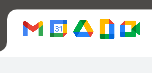 Maybe even smaller. And never that close together. I don’t know about you, but I can’t tell them apart when I’m not looking directly at them. What exactly are you looking for? They all have every color, and not even in the same order or direction — you see how some are red, yellow, green, blue and one is red, yellow, blue, green? Three (with Gmail) clockwise and two anti-clockwise, too. Sounds unimportant but your eye picks up on stuff like that, maybe just enough that you’re more confused.
Maybe these would have been better if they all started with red in the top left or something, and cycled through. They don’t randomize the order of the colors in the main Google logo, right? Ultimately these little blobs just resemble toys or crunched up candy wrappers. At best it’s plaid, and that’s Slack territory.
At first I thought the little red triangular tabs were a nice visual indicator, but somehow they messed that up too. Each icon could have had the tab in a different corner, but Calendar and Drive both have it on the bottom right. They’re different kinds of triangles, at least — but that’s a freebie from trigonometry.
You’ll also notice that the icons have a sort of lopsided weight. That’s because against a light background, different colors have different visual salience. Darker colors pop more against a white background than yellow or the tiny bit of red, making the icons seem to have heavy “L” aspects to them, on the left in Gmail and Calendar, bottom left in Drive and Meet, bottom right in Docs. But in an inactive tab, the light color will be more salient, and those L’s will seem to be on the other sides.
My guess is the design team spent a lot of time looking at these logos at a fairly large size, and didn’t think too hard about how they’d look in actual use on the screen a cheap Chromebook or Android phone. You can tell because they all have really small features that will be lost to aliasing when they’re 20 pixels wide.
Shape
This is a good segue into the shape problems, because the perceived shape of these icons will change depending on the background. The original icons solved this by having a solid shape unique to them, and the background didn’t really leak through. Even the camera-shaped “hole” in meet is given a material and shadow.
You have to be real careful about transparent parts of your design — positive and negative space and all that. If you surrender any part of your logo to the background, you’re at the whim of whatever UI or theme the user has chosen. Will these logos look good with a hole in the middle looking onto a dark grey inactive tab? Or will the hole always be filled in with white, making it positive space when on a dark background and negative when on white? I’m not saying there’s a 100 percent right answer, but whatever it is, Google didn’t choose it.
This is correct. (via https://t.co/8DV9Wu6iMA) pic.twitter.com/d3RpCLTihk
— Frederic Lardinois (@fredericl) October 26, 2020
Anyhow the issue with these icons is that their shapes are bad. They’re all hollow, and four of them are rectangular if you include Gmail’s negative space (and we do — Google taught us to). The general shape of a container is a perfectly good one to use now and then, but at a glance four out of five are basically just angular O’s. Do you want the tallish O, the pointy one, or one of the two square O’s with slightly different color patterns? At a distance, who can tell? They only now resemble the thing they’re supposed do if you look really closely.
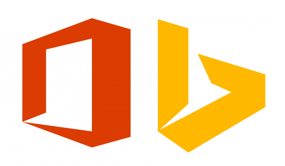
Now that I think of it, those shapes really scream Office and Bing too, don’t they? Not great!
 While we’re at it, the thin type in the Calendar’s open space is pretty anemic compared with the big thick border, right? Maybe they should have gone with bold.
And last, the overlapping colors make for trouble. For one thing it makes the Drive logo look like a biohazard symbol. But it adds a lot of complexity that’s hard to follow at a small scale. The original Drive logo had three colors, to be sure, and a little drop shadow so you’d see it was a Moebius strip implying infinity and not just a triangle (that’s gone too — so why keep the triangle?) — but the colors set each other off: Blue and yellow make green, two primaries and their secondary.
The new ones have all three primaries, one secondary, and two tertiary (if you count darkness as a color). They don’t help the shapes exist in any relatable way. Are you looking “through” them? That doesn’t seem right. They kind of fold, but how? Are the ribbons these are made of twisting? I don’t think so. The shapes aren’t things — they’re just arrangements, suggestions of the things they once were, removed one step too far.
Brand
Google’s no stranger to throwing value in the trash. But you’d think that sometimes they’d recognize when they have a good thing going. The Gmail logo was a good thing. I have to say I preferred the old angular one when they switched to the rounded-off icon some years back, but it’s grown on me. The natural “M” shape of a the envelope is emphasized so well, and the red-and-white color is so instantly recognizable and readable — this is the kind of logo you hold onto for a long, long time. Or not!
The problem here is that now Gmail, which has essentially operated as its own, completely invincible brand for more than a decade (which is eons in tech, let alone tech logos), has been put on equal footing with other services that aren’t as trusted or as widely used.
Now Gmail is just another rainbow shape in a sea of very similar rainbow shapes, which tells the user “this service isn’t special to us. This is not the service that has worked so well for you, for so long. This is just one finger on the hand of an internet giant. And now you can never see one without thinking of the other.”
Same for all the rest of these little color wheels: You’ll never forget that they’re all part of the same apparatus that knows everything you search for, every site you visit, and now, everything you do at work. Oh, they’re very polite about it. But make no mistake, the homogeneous branding (for all its color heterogeneity) is the prelude to a brand crunch in which you are no longer just a Gmail user, you’re in Google’s house, all day, every day.
“This is the moment in which we break free from defining the structure and the role of our offerings in terms that were invented by somebody else in a very different era,” Google VP Javier Soltero told Fast Company.
The message is clear: Out with the old — the things that built your trust; and in with the new — the things that capitalize on your trust.


Comment