If you’re searching for the perfect palette for your interior design project, what better place to turn than the art world’s masters of color?
Throughout history, famous artists have gained renown for their expert, experimental and revolutionary approaches to color. Some paintings and prints became popular because of their pleasing, jarring or conversation-sparking juxtapositions of hues.
To help you devise an eye-grabbing color scheme in your living space, we put together 10 mood boards informed by famous colorful paintings. We also show how these palettes can be incorporated in an interior through furniture and decorative objects with hues drawn from some of art history’s most iconic and influential works.
1. The Last Supper, 1495–98, by Leonardo da Vinci
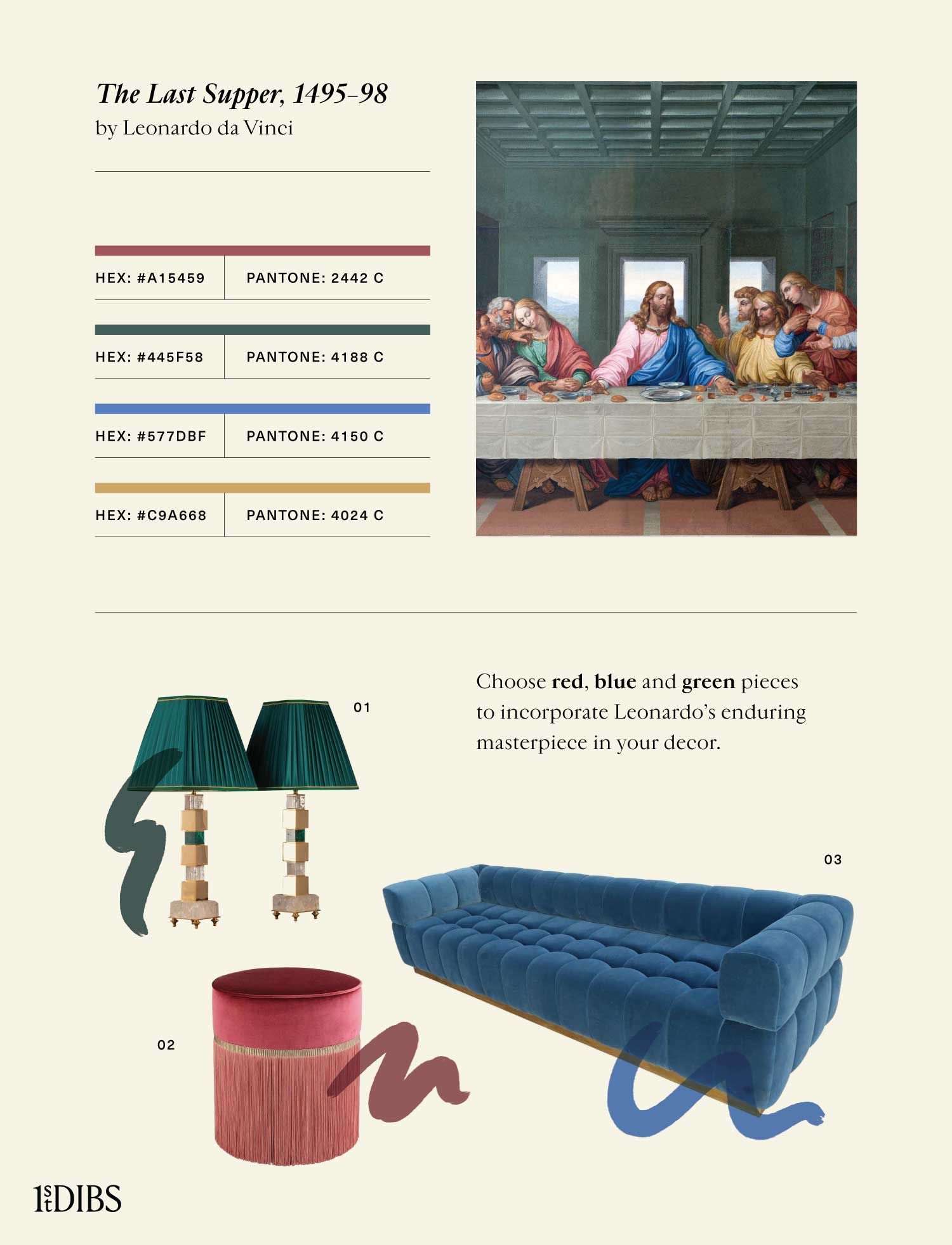
Created by Leonardo da Vinci (1452–1519) for the Santa Maria delle Grazie monastery in Milan, Italy, The Last Supper is one of the most recognizable Renaissance masterpieces. The painting captures the moment after Jesus told the apostles that one of them will betray him.
Instead of the traditional fresco technique of painting on wet plaster, Leonardo experimented with tempera applied to a dry wall; unfortunately, as a result, the luminous colors soon began to deteriorate and flake off. Even with the damage the work has sustained and the often unsuccessful efforts at restoration, we can appreciate the artist’s adroit use of color. Jesus wears traditional red and blue robes, while the apostles are adorned in other bright colors, all contrasting with the long white table in front of them.
To draw color inspiration from this famous painting, look to the bright reds, blues and oranges, as well as greens, broken up by off-white shades.
Featured Products:
2. Girl with a Pearl Earring, 1665, by Johannes Vermeer
Dutch Baroque painter Johannes Vermeer (1632–75) often depicted domestic figures. He was moderately successful in his lifetime, but his few known paintings propelled him to the ranks of the most popular art-historical figures over the years. His work is celebrated for his delicate and expert attention to light and color.
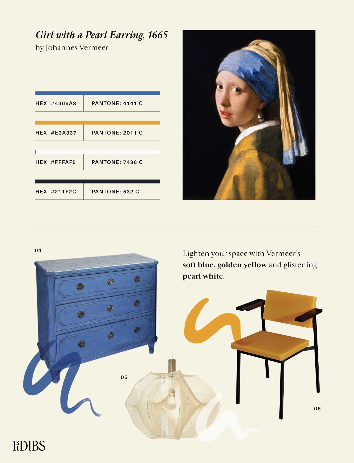
Vermeer’s Girl with a Pearl Earring is a well-known “tronie,” or painting of an anonymous figure who has caught the imagination of the artist. It shows a fictitious young girl in a turban with a large pearl dangling from her ear. She glances over her shoulder to meet the eyes of the viewer and parts her lips as if about to speak.
To bring the gentle mystery of this painting to your space, decorate with soft blues, golden yellows and dark accents. Add a nod to the enigmatic figure’s jewelry with a shining pop of white.
Featured Products:
- Neoclassical blue chest of drawers, ca. 1860
- Paul Secon SWAG for Sompex white hanging lamp, ca. 1970s
- Sabine Marcelis SE69 yellow armchair, new
3. The Great Wave off Kanagawa, 1820–31, by Katsushika Hokusai
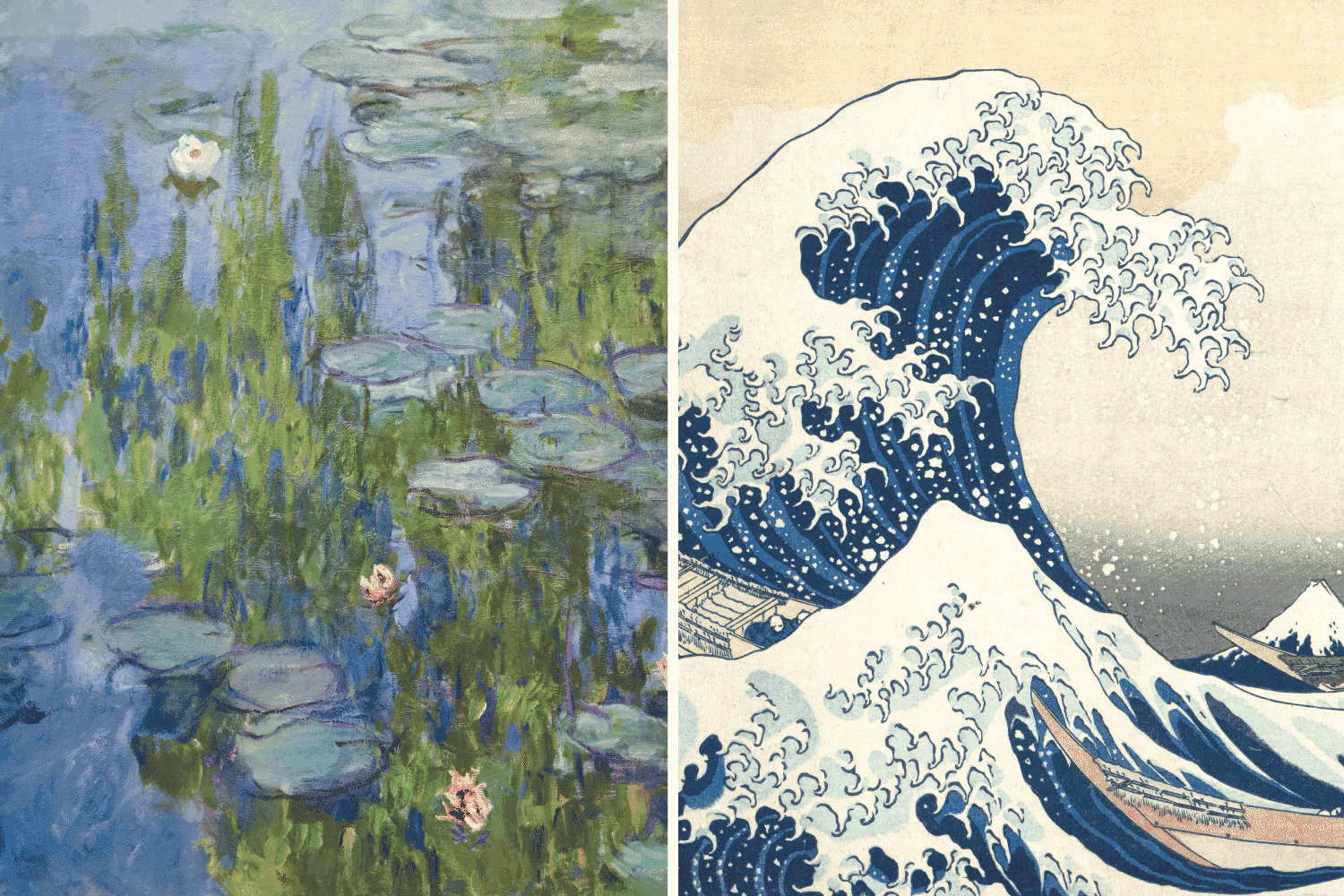
Japanese ukiyo-e artist Katsushika Hokusai (1760–1849) created the woodblock print The Great Wave off Kanagawa as part of his “Thirty-Six Views of Mount Fuji” series. Famous for book illustrations as well as paintings, Hokusai captured the grand power of nature by depicting Mount Fuji, Japan’s tallest peak, as a tiny triangle seemingly being swallowed by an enormous wave. Immensely influential for both Japanese and Western artists, the work showcases Hokusai’s signature combination of indigo and Prussian blue.
To bring this sophisticated and powerful painting to life in your home decor, focus on various shades of blue, contrasting them with golden yellow and peach accent pieces.
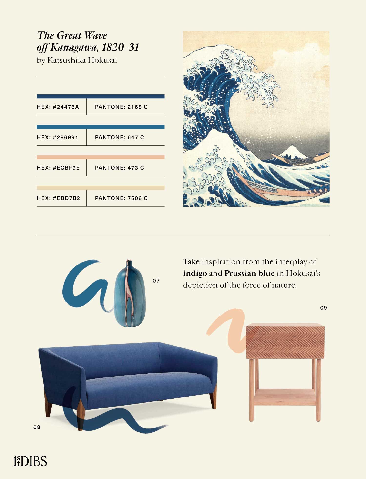
Featured Products:
7. Elyse Graham Mississippi blue vase, new
8. Dare Studio Ernest blue sofa, new
9. Laura Noriega cedar nightstand, new
4. In the Loge, 1878, by Mary Cassatt
Iconic artist Mary Cassatt (1844–1926) was the only American to exhibit alongside the French Impressionists. Her style and compositions were influenced by both European and Japanese masters. In her paintings and prints, Cassatt portrayed families, the theater and mothers with children, among other domestic subjects. The works, which convey not just the social but also the inner lives of women, feature light pastel colors and fluid brushstrokes.
In the Loge was the first of her Impressionist paintings exhibited in the United States. It depicts a woman intently watching a performance at the Comédie-Française theater in Paris. Capture the soft and sophisticated atmosphere of Cassatt’s painting by juxtaposing dark pieces of furniture, art and decor with warm yellows and oranges.
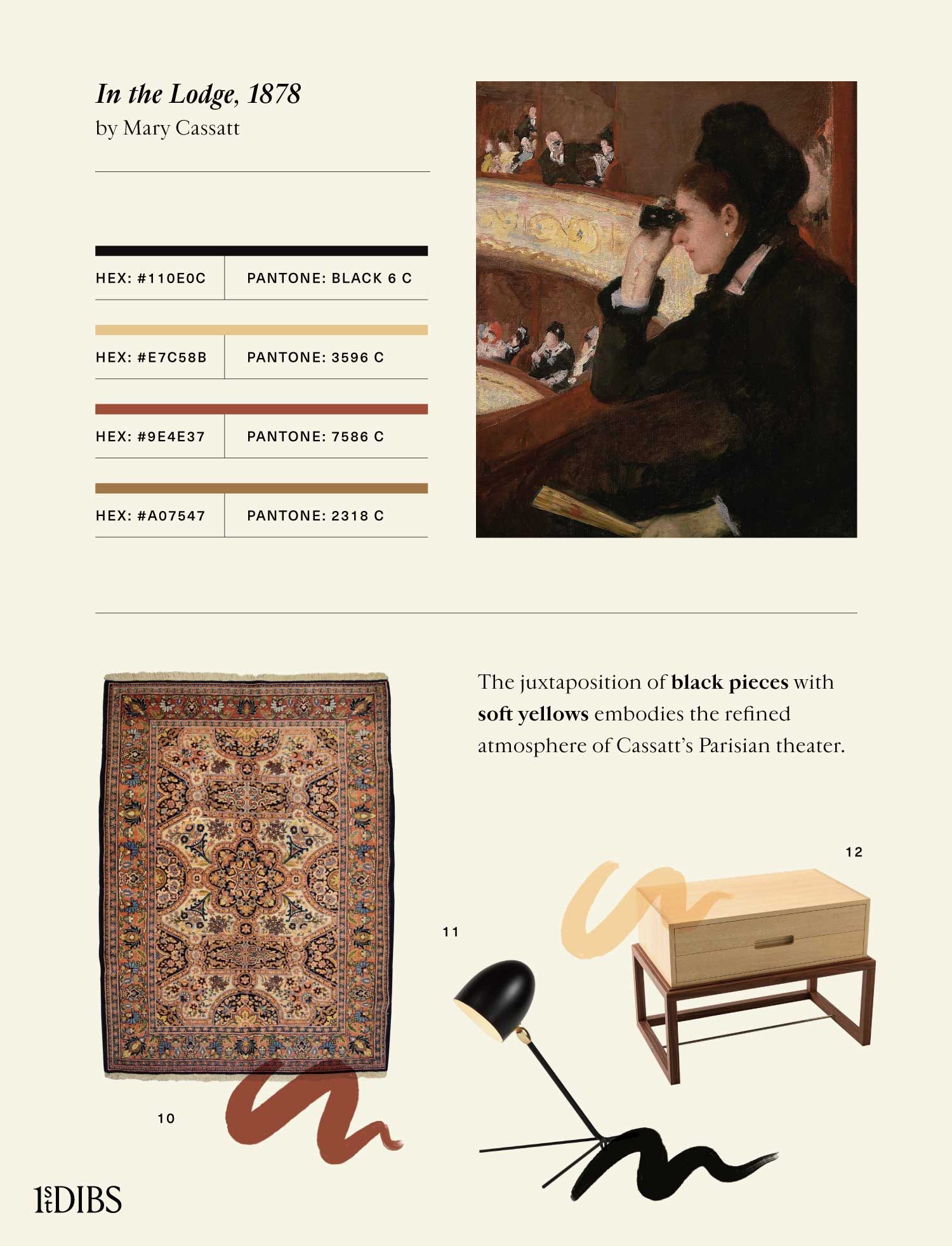
Featured Products:
10. Semnan carpet in cream, black and pink, 1930
11. Serge Mouille Cocotte black lamp, new
12. Herringbone Oona oak and walnut bedside table, new
5. The Starry Night, 1889, by Vincent van Gogh
Dutch Post-Impressionist Vincent van Gogh (1853–90) created thousands of oil paintings, watercolors and drawings, which became highly coveted only after his death. Van Gogh, who suffered from mental illness throughout his life, didn’t receive much acclaim while alive, but he became posthumously celebrated for his bold, expressive use of color. Although he painted from life, his hues are far more vibrant than those found in nature; his technique, involving lively paint application, conveys movement.
Van Gogh painted The Starry Night, one of his most recognizable works, while in an asylum in Saint-Rémy-de-Provence, France. Inspired by the view from his window, it depicts a night sky full of swirling cosmic patterns. Select furniture and decorative objects displaying deep blues, greens and yellows, as well as pieces with flowing shapes, to imbue your home with the nocturnal expressiveness of Starry Night.
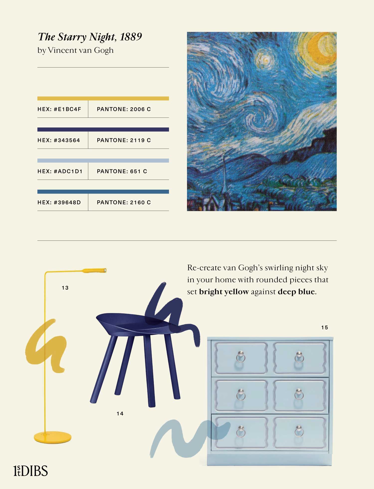
Featured Products:
13. Foster+Partners for Lumina Flo yellow floor lamp, new
14. Stefan Diez for e15 Mr. Collins lapis blue stool, new
15. Dorothy Draper España blue nightstand, 1960
6. Water Lilies, 1915, by Claude Monet
French painter Claude Monet (1840–1926) is known for the way he used color. A seminal figure in the Impressionist movement, which got its name from his painting Impression, Sunrise (1873), he created bright evocations of light and its changing effects. Dissatisfied with traditional painting methods, Monet experimented with color throughout his career, developing a technique that had a huge influence on the artists who followed him.
Monet famously said, “Color is my daylong obsession, joy and torment,” and used vibrantly hued paints, sometimes straight from the tube. He worked en plein air, often returning to one site at different times of day to capture variations in the play of light. In the last 30 years of his life, Monet focused on a series of 250 oils portraying his water lily garden in Giverny.
For a Monet-inspired interior, choose tranquil hues reflecting the complex interplay of purples, pinks and greens in his water lily ponds.
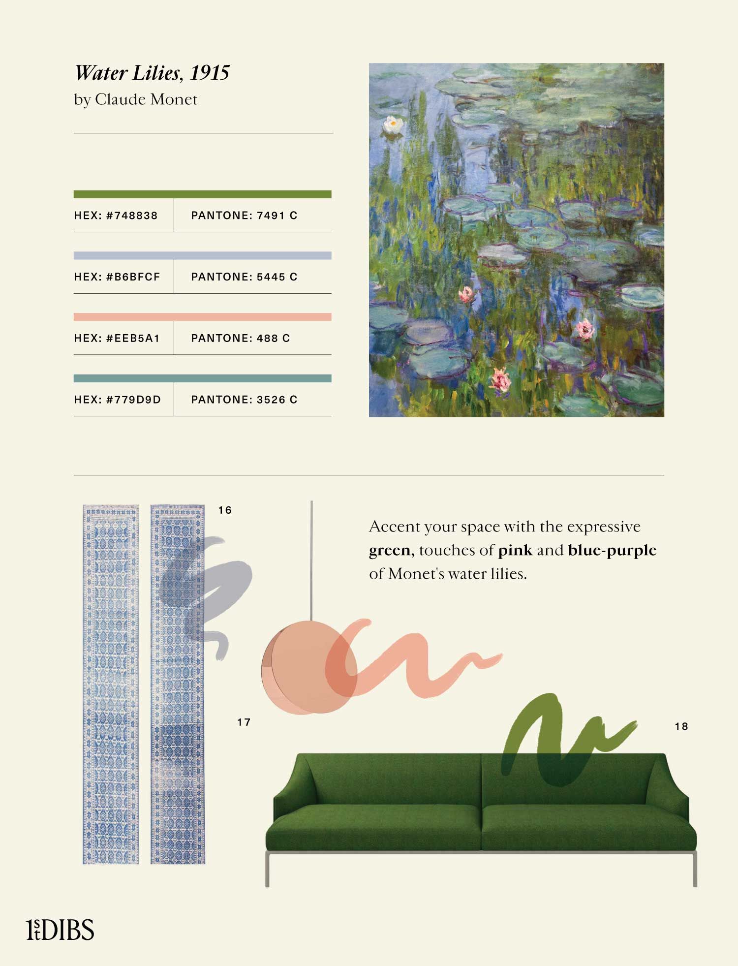
Featured Products:
17. Eva Marguerre and Marcel Besau for e15 North copper pendant light, new
18. Christophe Pillet for Cappellini High-Time green sofa, new
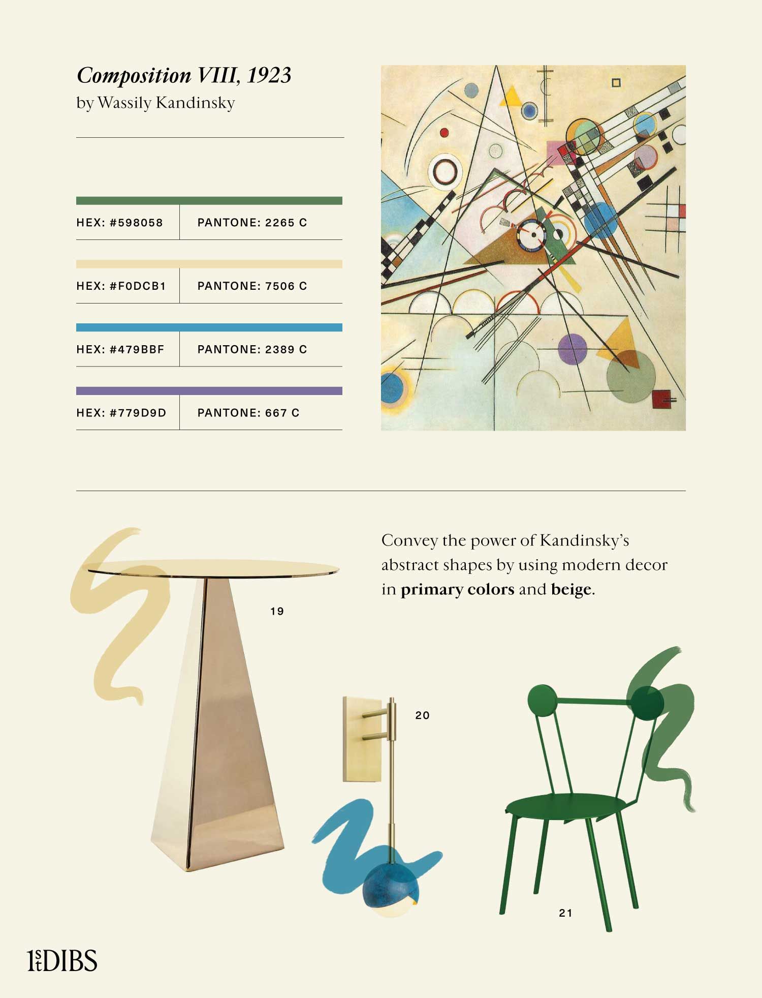
7. Composition VIII, 1923, by Wassily Kandinsky
Russian-born French painter Wassily Kandinsky (1866–1944) was a key figure in the abstract art movement of the early 20th century. Believing that color and shapes, especially geometric ones like circles and triangles, had a greater power than language to provoke emotions, he considered abstraction a form of pure expression. In his book Concerning the Spiritual in Art, Kandinsky wrote, “Color is a means of exerting direct influence upon the soul.” His use of geometric shapes and primary colors greatly influenced the work of later abstractionists.
The colorful Composition VIII typifies Kandinsky’s approach to abstraction. To incorporate his palette and penchant for geometric forms into your decor, deploy primary colors mixed with beiges and purples and select modern pieces with sharp lines and angles.
Featured Products:
19. Konekt brass side table, new
20. Trella Benedict blue and brass wall sconce, new
21. Chapel Petrassi Haly green chair, new
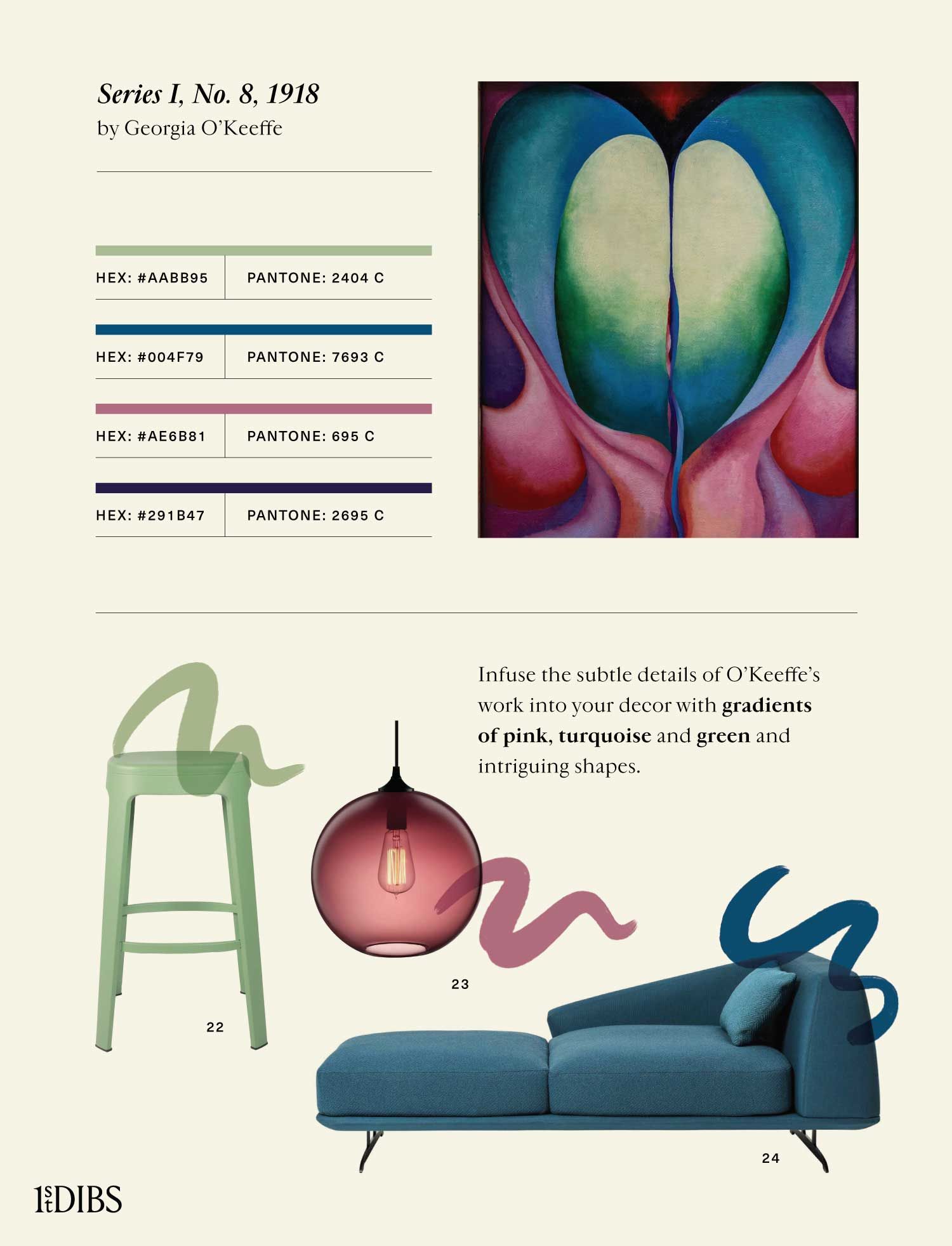
8. Series I, No. 8, 1918, by Georgia O’Keeffe
An important American modernist, Georgia O’Keeffe (1887–1986) is perhaps best known for her magnified images of natural subjects. O’Keeffe painted plants, landscapes and bones close-up and at large scale, emphasizing their shapes, lines and colors to distill them into abstract compositions. Her flower paintings are among her most celebrated pieces.
O’Keeffe’s massive, innovative work invites viewers to observe and confront small details and nuances of light that they might not have noticed in natural settings. To bring the subtleties of O’Keeffe’s abstract art into your interior design, consider color gradients from light to nearly black, as well as interesting soft shapes.
Featured Products:
22. Emiliana Design Studio Ombra green barstool, new
23. Niche Solitaire plum pendant light, new
24. Parisotto + Formenton 1 for Baleri Italia blue lounge, new
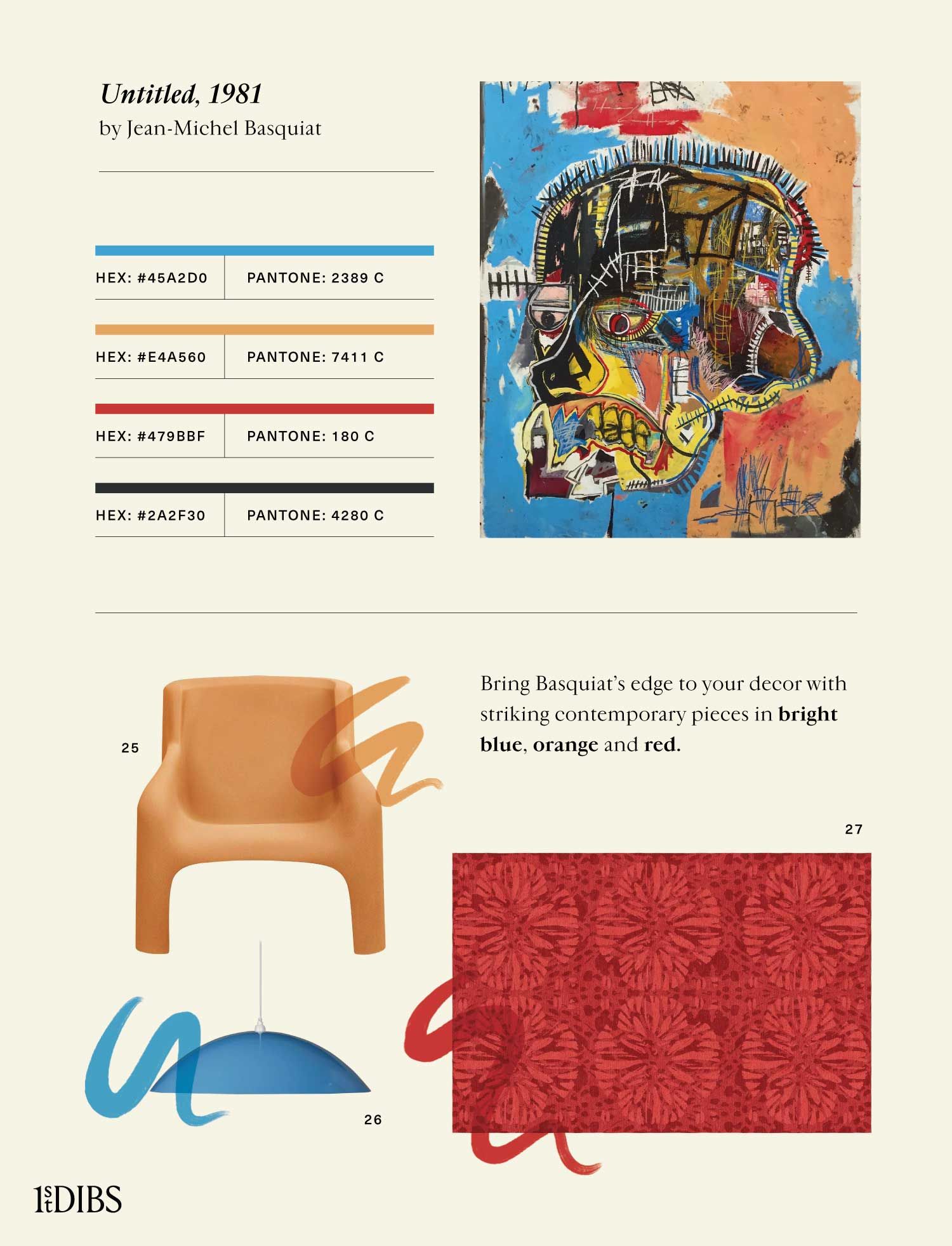
9. Untitled, 1981, by Jean-Michel Basquiat
Jean-Michel Basquiat (1960–88) was a painter, poet and graffiti artist who rose to fame at a young age in 1980s New York. Part of the neo-Expressionist movement, which sought to create artworks based on subjectivity and raw emotion, Basquiat drew on his Caribbean heritage and Black identity, as well as pop culture and commercial art, in his work. His pieces often convey a commentary on harmful stereotypes and power structures.
Among Basquiat’s most coveted works are his skull paintings, such as Untitled, 1981. Inspired by anatomical drawings and reminiscent of X-ray images, it comments on Western artists’ cultural appropriation of African masks, while also exploring the concept of identity. With its powerful mark making and intense colors, the painting provides a somewhat frenzied portrayal of both the inside and outside of a head simultaneously.
Reference this compelling yet eerie painting with pieces boasting striking lines and strong blue, red and orange hues.
Featured Products:
25. Carlo Bartoli for Arflex Gaia orange armchair, 1960
26. Souda blue pendant lamp, new
27. Allegra Hicks Sunflower red rug, new
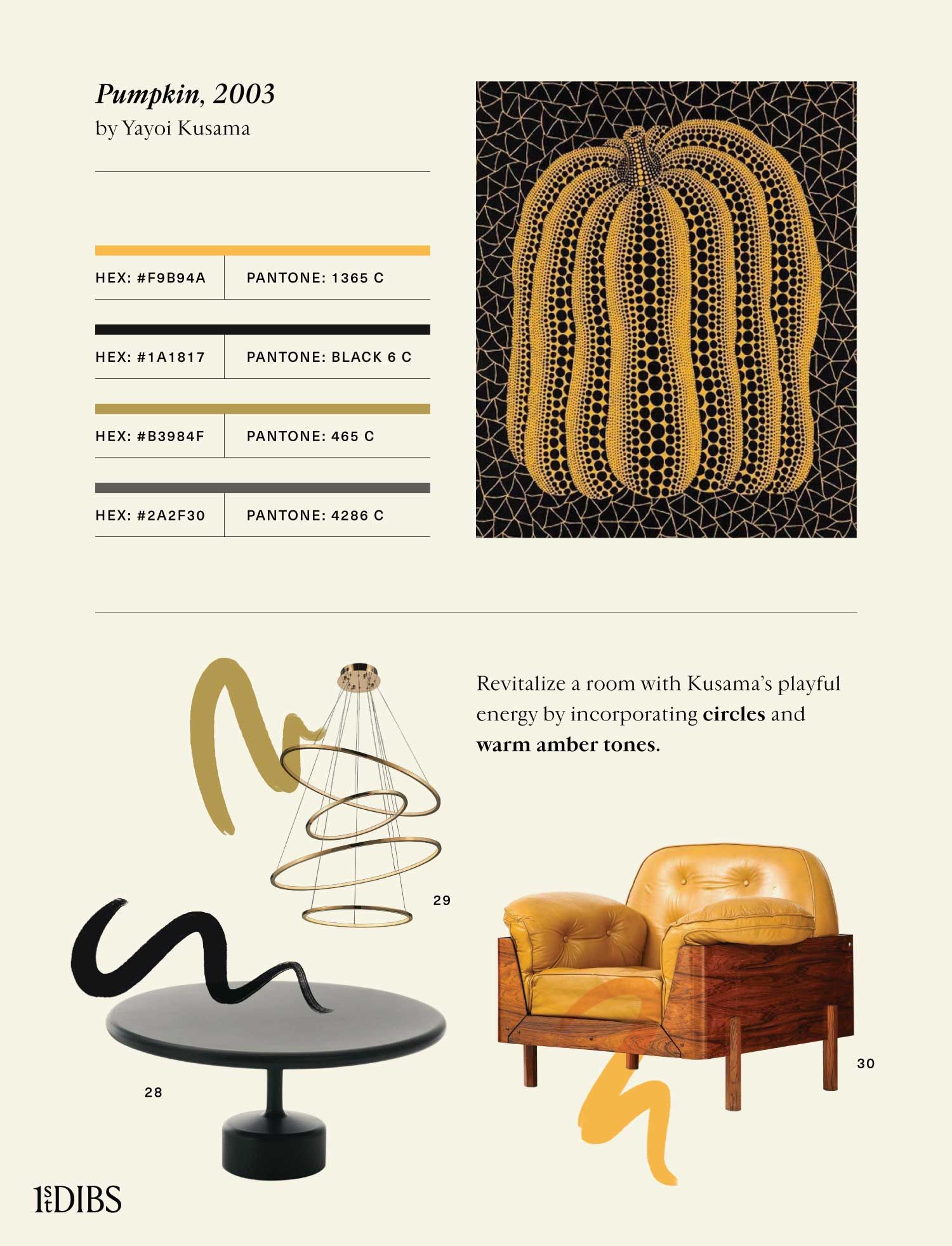
10. Pumpkin, 2003, by Yayoi Kusama
Yayoi Kusama, born in Japan in 1929, is one of the world’s most celebrated living contemporary artists. Her oeuvre includes sculptures, paintings and surreal, immersive installations, such as her famous “Mirror Rooms.”
When she came to the U.S., in 1957, Kusama had great success in the New York avant-garde scene. Her art is characterized by dense patterns, bright colors and, of course, her signature polka dots. Kusama has been open about her mental health struggles and has said that her work is often inspired by vivid hallucinations and an obsession with repetition and infinity. Now 92, she lives in Japan and continues to create new pieces.
Kusama’s paintings and sculptures of spotted pumpkins are some of her most recognizable. For a playful, Kusama-inspired interior, choose pieces that incorporate the bright yellow of her pumpkins and a repeated motif of circles.
Featured Products:
28. Maddalena Casadei Tavolotto black coffee table, new
29. Swirl gold chandelier, new
30. J.D. Moveis e Decoracoes yellow lounge chair, ca. 1965
When strapped for design ideas, you can jump-start your creativity by looking to the world of fine art. For more inspiration, check out our wall art tips and artistic offerings on 1stDibs.


