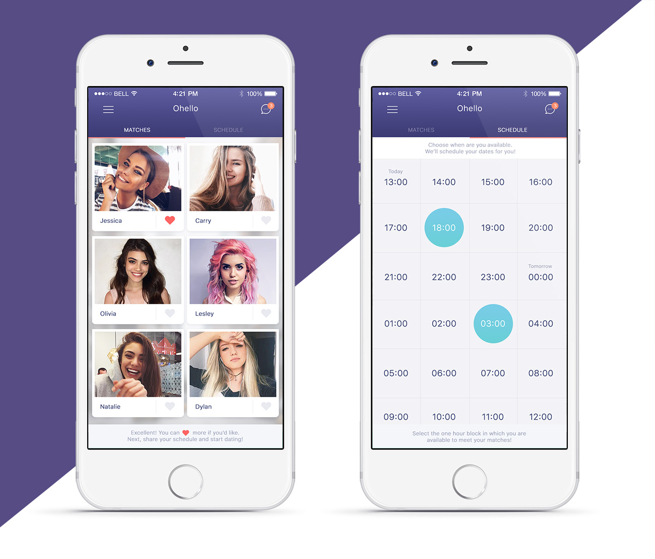
new dating app design - young, fresh, clean

Want to win a job like this?
This customer received 54 app designs from 8 designers. They chose this app design from eMango as the winning design.
Join for free Find Design Jobs- Guaranteed
App Design Brief
Project Brief
Ohello is the world's first dating app that actually arranges dates. The process consists of 3 easy steps:
1. use our calendar to tell us when you'd like a date
2. browse singles nearby and select who you'd like to meet
3. when your date is 1 hour away, the app will find you a nice venue in the neighborhood and send one of your matches there to meet you. All you need to do is show up and have a good time.
This design assignment consists of creating a fun, fresh & user-friendly design for the wireframes created by our UX designer. Included are 2 screens:
1. the 'calendar' screen
2. the 'matches' screen
Also included is our style guide for your reference. Feel free to use as much or as little from this guide as you please. It would be nice if we could remain somewhat consistent with our previous design (which was purely based on this style guide) but we also want you to be creative and show off your skills so by no means should you feel obliged to conform to it.
Things to consider
1. 'calendar'
this is where you tell the app when you're free for a date. You can select as many time slots as you want. The info bars at the top and the bottom are 'sticky' (will stay in place no matter where in the screen you scroll to).
Everything about this page needs to be designed: not just in terms of spacing, font and coloring of the calendar itself but also the sticky bars at the bottom and top, and the interactions (when you select a time slot, what happens visually? How will it show that this slot was selected?).
TIP: please ignore the black vs white time slot distribution you see in the image. This was meant to signify where daytime becomes nighttime and vice versa, but we're not doing that anymore. So the only difference between blocks will be the difference between a selected and an unselected block. Make sure that difference is clearly visible in your design.
2. 'matches'
this is where you tell the app whom you'd like to meet with. You can select as many people as you want by clicking their 'heart' icon. You can scroll down to see more people and again the info bars at the top and/or bottom are sticky. The design elements for this page are:
a. the page itself (sizing, spacing of the images, etc.)
b. the interactions (how does a selected heart look, how does that compare to an unselected heart)
ICONS: feel free to come up with your own iconography (ie for the 'chat' icon in the top right, and/or the 'heart' icon signifying you want to meet this person. We really like the fact that the 'matches' and 'calendar' tabs are signified with words rather than icons, but feel free to get creative on this front as well. If you can make it prettier, we're all ears :) Whatever you do on this front, make sure all your icons and the rest of your work are/is free of copyright so we can actually use them in a commercially distributed app.
The winner of this contest may get awarded a follow-up project where they will be asked to design the entire app for us.
Updates
Project Deadline Extended
Reason: Thank you all for your submissions. We got some promising designs but nothing that was good enough just yet. We gave some feedback for improvement and wanted to give you guys some more time to get it right. New submissions are welcome too of course. Don't hesitate to contact us if you have any questions.
Added Sunday, January 22, 2017
Target Market(s)
singles
Industry/Entity Type
Dating
Look and feel
Each slider illustrates characteristics of the customer's brand and the style your logo design should communicate.
Elegant
Bold
Playful
Serious
Traditional
Modern
Personable
Professional
Feminine
Masculine
Colorful
Conservative
Economical
Upmarket
Requirements
Must have
- fresh, clean, user-friendly design of the 2 pages provided. Your design choices should include decisions about font, sizing, colours, spacing, etc.
Nice to have
- custom icons, see project brief