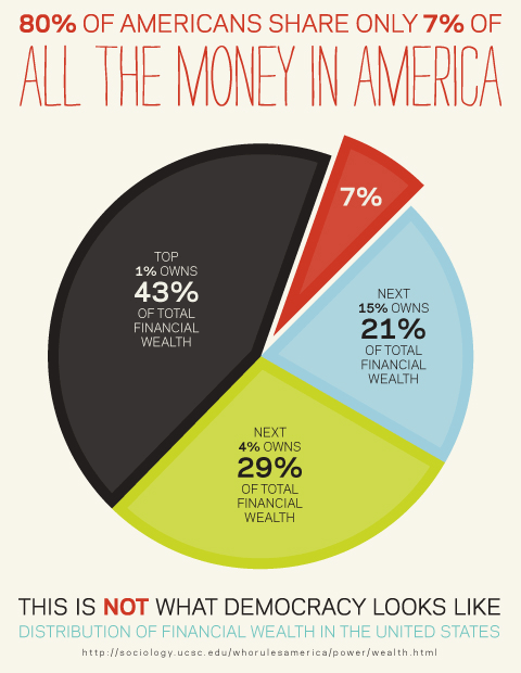
Another bad chart, this time from MoveOn.org:

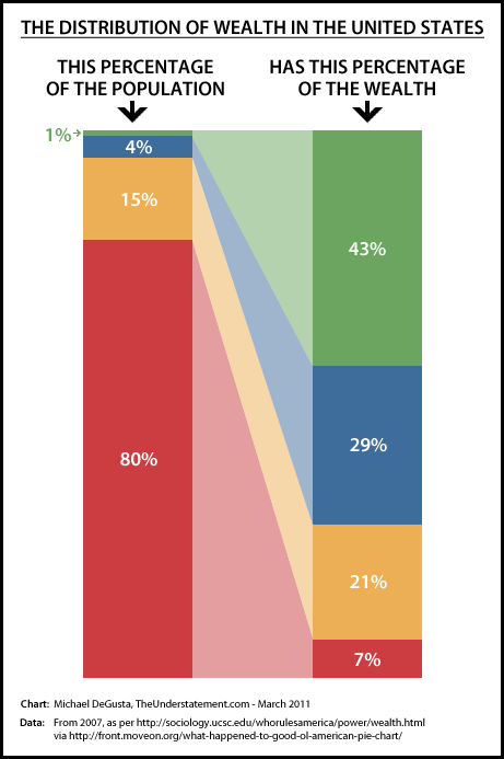
The most obvious problem with this chart, as correctly identified by Neven Mrgan, is that it doesn’t provide a visual correlation between the population and wealth distributions. In fact, it doesn’t provide a visual display of the population distribution at all.
Here’s my attempt to respond to Mr. Mrgan’s complaint:

Needless to say there are also other problems with this graphic. For instance, the breakdown of the population into 1%, 4%, 15%, and 80% seems suspiciously arbitrary. I also can’t resist pointing out that democracy is of course a political system, not an economic one. The source data has plenty of numbers to delve into and perhaps that’ll be a topic for a future post.
Update: I just started examining the source data and the first thing to catch my eye is that this distribution from 2007 is actually not that different from what it was in 1983. The distribution between the top 1%, the next 19%, and the bottom 80% in 1983 was 43% - 48% - 9%, and in 2007 it was 43% - 50% - 7%.
Looked at a bit differently though, the wealth of the bottom 80% has been fairly volatile. It dropped from 8.7% in 1983 to a low of 6.6% in 1989 - a 24% decline in 6 years. Then it shot up to 9.5% in 1995 - a 44% gain in 6 years, before heading back down to 7.0% in 2007. Since this is all expressed as share of the country’s total wealth, it’ll take further review of the data to determine to what extent this volatility was the bottom 80%’s wealth changing versus the wealth of the top 20% changing.
It also turns out that the net worth of the bottom 80% is substantially higher than their financial worth, albeit declining and still well under half what the top 1% has. Pretty terrible any way you slice it.
yvnglvng-blog liked this
 harrystylesno liked this
 nocturnal-revenge liked this
 antiromeoclub reblogged this from understatementblog
 camere-de-supraveghere-blog liked this
understatementblog posted this
- Show more notes


