
Bathroom of the Week: Scandinavian Minimalism With a Little Bling
A designer works the homeowners’ love of purple into a natural palette in this new bathroom

Not since Prince outfitted Paisley Park has a Minneapolis-area homeowner loved purple so much. In fact, this family of six’s dog is named Purple. When the owners decided to build their new home in a rural area outside the Twin Cities, they tasked Aspect Design Build with giving purple its due.
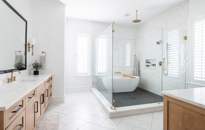
While other areas of the new home have very bold elements, the primary bathroom is more subdued. The style mandate given to husband-and-wife team Shaun and Stacia Winkler was Scandinavian minimalist with a touch of Japandi and a little bling. While it wasn’t the easiest combination to nail, the duo delivered by employing a thoughtful balance of the elements. This bathroom, with deep aubergine tiles, minimalist cabinetry, heavy-duty charcoal gray bathtub and crystal-embellished faucets, fits the style directions to a T.
While other areas of the new home have very bold elements, the primary bathroom is more subdued. The style mandate given to husband-and-wife team Shaun and Stacia Winkler was Scandinavian minimalist with a touch of Japandi and a little bling. While it wasn’t the easiest combination to nail, the duo delivered by employing a thoughtful balance of the elements. This bathroom, with deep aubergine tiles, minimalist cabinetry, heavy-duty charcoal gray bathtub and crystal-embellished faucets, fits the style directions to a T.
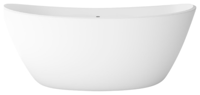
“Accommodating this bathtub was a bit of a journey,” Shaun says. At 800 pounds without a person or water in it, the tub required meticulous structural engineering to support its weight.
Bathtub: Concretti
Browse bathtubs in the Houzz Shop
Bathtub: Concretti
Browse bathtubs in the Houzz Shop
Stacia mostly worked with the wife on the design of the room. “While my client liked Scandinavian minimalism, I realized at some point that she had an inner maximalist too,” Stacia says. Her first clue came when her client presented her with these polished gold-and-crystal faucets she wanted to use in the bathroom. “The key was to rein in the different layers and get the balance just right,” the designer says.
The wall behind the vanity is an outside wall, so it required a secondary wall for plumbing. To accommodate this, Stacia created a ledge atop the backsplash. It’s handy for setting down a toothbrush and gives an added layer of dimension to the backsplash.
Faucets: MaestroBath
The wall behind the vanity is an outside wall, so it required a secondary wall for plumbing. To accommodate this, Stacia created a ledge atop the backsplash. It’s handy for setting down a toothbrush and gives an added layer of dimension to the backsplash.
Faucets: MaestroBath
A monolithic approach helped Stacia find the right balance between minimalist and bling. For example, the fully tiled vanity wall and the composition of the cabinets are monolithic. Also, keeping other elements simple created balance. The inset vanity cabinets have plain fronts and finger pulls rather than metal hardware. The uncomplicated look of the cabinetry lets the faucets and mirror frames shine without other distractions.
“This cabinetry was based on another house we’d done that these clients had seen and liked,” Stacia says. “A lot of the cabinetry throughout the house was true to my client’s love of pared-back Scandinavian restraint.”
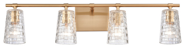
Vertical strips of LED lights integrated into the sides of the cabinets provide good makeup lighting. A pendant light in the center, composed of irregular natural rock crystals wrapped in gold, adds a bit more bling overhead.
Stacia found ready-made mirrors that echo the oval shape of the bathtub and the polished gold of the faucets. Their 60-inch height stands up to the 10-foot-high ceilings.
Pendant light: Roxx three-light pendant with chain in Gilded, Craftmade
“This cabinetry was based on another house we’d done that these clients had seen and liked,” Stacia says. “A lot of the cabinetry throughout the house was true to my client’s love of pared-back Scandinavian restraint.”
Vertical strips of LED lights integrated into the sides of the cabinets provide good makeup lighting. A pendant light in the center, composed of irregular natural rock crystals wrapped in gold, adds a bit more bling overhead.
Stacia found ready-made mirrors that echo the oval shape of the bathtub and the polished gold of the faucets. Their 60-inch height stands up to the 10-foot-high ceilings.
Pendant light: Roxx three-light pendant with chain in Gilded, Craftmade
The large-format floor tiles (24 by 36 inches) also have a monolithic look, broken up by brass inlays that add subtle bling to the floor. The area under the tub is a smaller limestone mosaic tile. “These tiles are cohesive and a close match to the wall color,” Stacia says. The softer neutrals balance out the deep color of the wall tiles.
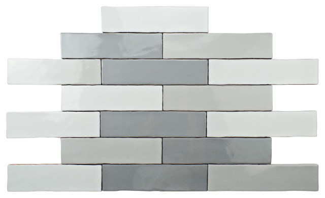
Handmade zellige tiles by Clé Tile for the walls was an early design decision. The deep eggplant tones are an elegant part of the purple spectrum. Also, these hues are in keeping with the natural material and color palettes in a way a brighter or bolder purple would not have been.
Find a bathroom remodeler
The countertop and backsplash are quartzite, a natural stone. Stacia chose one that had subtle hints of purple in it to play off the tile color without being overwhelming.
This photo also shows the dark charcoal grout. “The dark grout added a depth of color,” Stacia says. “It looks shadowy and more cohesive. It also gave the tiled wall a more monolithic look.”
Shop for a bathroom sink
This photo also shows the dark charcoal grout. “The dark grout added a depth of color,” Stacia says. “It looks shadowy and more cohesive. It also gave the tiled wall a more monolithic look.”
Shop for a bathroom sink
The sinks have organic irregular shapes and don’t match each other. Stacia put a lot of consideration into placing them the right way. “The way we placed them in relation to one another provides some semblance of symmetry,” she says.
Check out our beginner’s guide to get started on your home project
Check out our beginner’s guide to get started on your home project
The shower is curbless, so the floor slopes imperceptibly toward a drain. The zero-threshold entry fits well with the more minimalist part of the style mandate, while clear glass provides a view of the eggplant tiles inside.
It’s hard to discern in the photographs, but Stacia left the edges of the tile raw rather than covering them with metal edging. These edges aren’t glazed, so the zellige’s natural brown clay is exposed. “We didn’t want another metal edge in here,” Stacia says. “I suggested we leave it gnarly and let it be what it is. Not everything has to fit into a mold, and we embraced the authenticity of the natural material.
“Of course, as a designer, when you propose something like this, be prepared with a backup plan,” she says with a laugh. In this case, the clients were on board with embracing the natural material.
Another mandate on the homeowners’ wish list was a series of body jets to warm them up during Minnesota’s long winters. Because these fixtures didn’t come with a lot of finish options, Stacia rolled with the black color of the jets. She played off the shower head and honed granite ledges within the shower stall. The black also plays off the deep charcoal color of the bathtub. “It was important to look at everything as part of a composition,” she says.
More on Houzz
Read more bathroom stories
Browse bathroom photos
Find a bathroom designer
Find a bathroom remodeler
Shop for your bathroom
More on Houzz
Read more bathroom stories
Browse bathroom photos
Find a bathroom designer
Find a bathroom remodeler
Shop for your bathroom


Bathroom at a Glance
Who lives here: A family of six
Location: Minneapolis area
Size: 210 square feet (20 square meters)
Design-build firm: Shaun and Stacia Winkler of Aspect Design Build
This view can be seen from all the way down a hallway outside the bathroom, so the bathtub area was important as a focal point not only for the room, but also from beyond. A large triple window provides a beautiful view of the tree canopy. The charcoal gray concrete tub serves as an eye-catching anchor beneath it.
A toilet room is to the left of the tub. Its door is painted Sherwin-Williams’ Burgundy, a color that also was used in the primary bedroom.
Find an interior designer on Houzz