


Color Play: Aqua Amps Up a Classic Blue-and-White Palette
A designer shares his secrets for making a traditional living room feel current

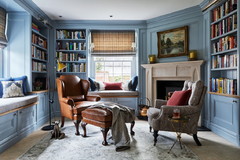
Howard deliberately avoided a black fireplace surround, currently a popular look. Instead, he chose a 4-inch-square blue tile, with a herringbone tile inset— “something that felt more detailed or interesting than your standard black surround,” he says.
In this photo, the sofa has been moved to the other side of the room (see the previous photo), a location that showcases the varied blues of the garden stool, sofa upholstery and fireplace surround. “Varying the shades of blue makes the room feel more layered,” he says. “We want rooms to feel like they were added to over time and not just put together with an installation.”
Designer secret: “Not everything in the room needs to be the superstar,” Howard says. In fact, too many standout pieces can compete, resulting in a room that feels cluttered and overwhelming. In this space, Howard points out, the style and color of the mirror over the fireplace are fairly simple, allowing the surround tile to become the star feature. Had he chosen a brightly patterned mosaic-edged mirror, it would pull the eye away from the beautiful fireplace.
Burlwood coffee table: antique; Tikki tape in Marine (embroidered raffia tape on sofa): Schumacher and Co.; garden stool: Carling Nichols via 1stdibs
Color sense: Though the color palette for this room is blue, white and aqua, orange flowers and mandarins create a striking contrast in the photos. You can achieve a similar look in your home by choosing botanicals that are complementary — meaning across the color wheel — from the dominant colors of your room’s palette. For example, often in designed rooms “when you see light green, you see pink or red roses,” Howard says. “Pink complements green really well because red and green are complementary to each other.”
Try this at home: Buy what you’re attracted to, but when you’re making purchases, “have an endgame in mind: I want this room to have this feel,” Howard says. “Don’t buy things that don’t have that feel.” For example, if you’re going for a modern vibe in your room, don’t buy many traditional pieces. If you’re not sure about a particular piece, it never hurts to skip it.
More
Choosing Hues: Roll With the Color Wheel
Pick-a-Paint Help: How to Create a Whole-House Color Palette


The Color Play
The play: Add a dash of aqua to a classic blue-and-white palette
The effect: Fresh energy for a collected, traditional living room
The backstory: This is the first room you see when you enter this newly built home in Jacksonville, Florida. “I wanted the first impression to be a really striking one,” says designer Andrew Howard of Andrew Howard Interior Design. He chose to accent the palette of blue and white with aqua to evoke the home’s coastal location and to inject energy into the room. “Blue and white, while classic and fresh and great, feels even better when it has another color to complement it and shine,” Howard says.
The inspiration: Howard’s starting point for the design was the lively drapery fabric, which he also used to upholster the two armchairs. The fabric encompasses each of the colors in the tricolor room palette.
Custom touches: Howard had embroidered raffia tape added to the skirt of the homeowner’s existing blue sofa. He also added tapes and trims elsewhere throughout the room — on the armchairs, drapes and accent chair seat.
The hard pieces were selected from antiques and secondhand sources, and have varied origins: The coffee table is from France, the bench from New York City and the magazine rack from Palm Beach, Florida. “We wanted everything in the room to feel custom or found,” he says.
As for the color of wood used throughout the room, Howard mixed the tones. “We prefer that none of the woods really match,” he says. Too many heavy wood pieces weighs down the space, he says.
351 Mermaid sisal rug in Sand Dollar: Fibreworks; 4200-21 Silhouettes English armchairs: Hickory Chair via Hickory Park Furniture Galleries; China Seas Sultan II in turquoise on white (fabric on armchairs and drapes): Quadrille via Lynn Chalk; tapes on armchairs and drapes: Samuel & Sons; CHD1126OW E.F. Chapman Marlborough double sconce in Old White: Visual Comfort; lamp: 1stdibs; Vanilla Milkshake (white paint on walls and trim) and 1-1 ratio of Covington Blue and white (blue paint on ceiling and trim): Benjamin Moore; wooden bone-inlay accent chair: Samurai; Corallina in Prussian Blue (fabric on accent chair seat): Schumacher and Co.