


Kitchen of the Week: Midcentury Mood in Blue, White and Wood
A designer updates a 1950s space with cherry cabinets, blue accents and an improved layout that includes an island

This couple loved the spirit of their 1950s kitchen but not how it manifested in robin’s egg blue cabinets, laminate flooring and a tight U-shaped layout. To create a modernized kitchen with an updated midcentury vibe, they turned to designer Jenni Jacobs for help.
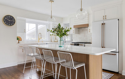
Jacobs removed the peninsula to open up the layout and incorporated space from a nearby butler’s pantry and breakfast area to add 97 square feet to the floor plan and create room for a slim island with seating. Flat-panel cherry cabinets, blue and green backsplash tiles and a salvaged vintage blue glass island pendant light evoke sleek yet cheerful midcentury style. And new appliances and integrated storage features firmly place the kitchen in modern times.
Jacobs removed the peninsula to open up the layout and incorporated space from a nearby butler’s pantry and breakfast area to add 97 square feet to the floor plan and create room for a slim island with seating. Flat-panel cherry cabinets, blue and green backsplash tiles and a salvaged vintage blue glass island pendant light evoke sleek yet cheerful midcentury style. And new appliances and integrated storage features firmly place the kitchen in modern times.
After: Jacobs knocked the kitchen back to the studs and removed a bulkhead. She also incorporated the tight butler’s pantry and unused breakfast area into the new layout, which helped add 97 square feet to the floor plan. Those moves freed up space to extend the kitchen and add a narrow island with seating.
Jacobs rejiggered the appliance layout too, moving the range to the wall that had held the fridge. The new fridge now sits opposite the range in the expanded kitchen area. “When we determined that the refrigerator would move to the other side of the kitchen, it left too much space that would be wasted if we didn’t add the workstation island,” Jacobs says. “This smaller-sized island made sense to give them more countertop area and a place to hang out in the kitchen.”
The salvaged vintage blue glass pendant light, which had hung in the breakfast area, now hangs over the island and helped inspire the room’s color palette. “Initially during the first site visit, we were taking in the vintage charm of the space,” Jacobs says. “The wife and I were looking at it and thought it was so great. We had to get the husband sold on it, but it really worked out great. We just cleaned it up a bit and made it a focal point in the kitchen.”
The flat-panel cherry cabinets with honey bronze pulls create warm midcentury style. “With the slab fronts, you have the option with the grain direction,” Jacobs says. “We thought the horizontal grain would add a soothing vibe to the space.”
The kitchen’s updated radiator, to the left of the range, got a custom enclosure. “We tried to get a streamline style so the radiator would almost disappear and not draw too much attention,” Jacobs says.
Cabinets: Seaside in natural cherry, Tedd Wood; hardware: Minetta pull in honey bronze, Top Knobs; paint colors: Horizon (walls), Ceiling White (ceiling) and Pure White (trim), Benjamin Moore
Find kitchen remodelers near you
The ceramic backsplash tile features varying shades of green and blue. “I think with the bold warmth of the cabinetry, we wanted a backsplash to balance that but also add personality to the space,” Jacobs says. A low-profile stainless steel gas cooktop and a 36-inch wall-mounted stainless canopy vent hood offer high-performance function without taking attention from the backsplash and cabinets. Soft-close drawers below the cooktop offer easy-access storage for pots and pans.
The quartz countertops have a light gray brushed finish with touches of warm charcoal and white. “It almost picks up some blue tones as well, so it plays really well with the backsplash,” Jacobs says.
Backsplash: Natural Hues collection in Rain, Ireland and Starlight, Daltile
Shop for range hoods
The quartz countertops have a light gray brushed finish with touches of warm charcoal and white. “It almost picks up some blue tones as well, so it plays really well with the backsplash,” Jacobs says.
Backsplash: Natural Hues collection in Rain, Ireland and Starlight, Daltile
Shop for range hoods
A blind-corner base cabinet between the cooktop and sink features an organizer with swing-out wood shelves. “Given the placement of the sink under the window, sometimes under the corners you don’t have the space to do a large corner cabinet like a lazy Susan,” Jacobs says. “This pullout was a way to maximize this space.”
Cabinet organizer: Classic wood half-moon 2-shelf, Rev-A-Shelf
10 Tips for Designing a Kitchen That’s Easy to Keep Organized
Cabinet organizer: Classic wood half-moon 2-shelf, Rev-A-Shelf
10 Tips for Designing a Kitchen That’s Easy to Keep Organized
A single-basin granite composite sink in a concrete gray complements the countertop color. The stainless steel pull-down faucet coordinates with the new appliances. A paneled dishwasher sits to the right of the sink. An existing double window that overlooks the backyard brings natural light and fresh air inside.
Four unassuming glossy white midcentury-style sconces with a brass backplate add task and accent lighting to various areas of the kitchen. The kitchen also includes new LED recessed ceiling lights.
Faucet: Litze, Brizo; wall sconces: Allegheny, Schoolhouse
Four unassuming glossy white midcentury-style sconces with a brass backplate add task and accent lighting to various areas of the kitchen. The kitchen also includes new LED recessed ceiling lights.
Faucet: Litze, Brizo; wall sconces: Allegheny, Schoolhouse
Slate gray 12-by-24-inch porcelain floor tiles in a herringbone pattern add movement to the room. “The homeowners wanted to do tile for durability,” Jacobs says. “These tiles were economical and we laid them in a pattern to make them feel special.”
Flooring: Norgestone in Slate, 12 by 24 inches, NovaBell
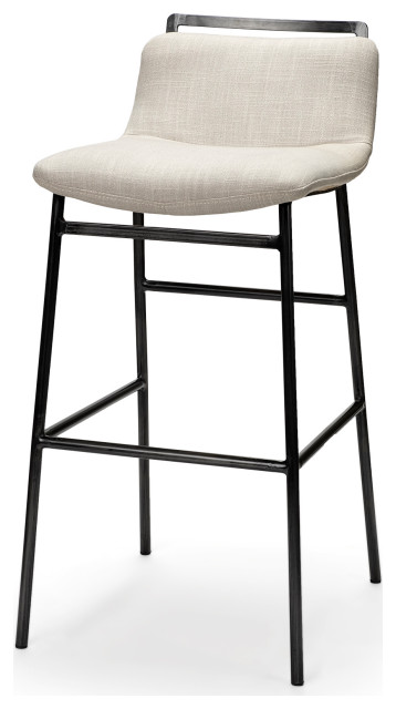
Shop for bar stools and counter stools
Flooring: Norgestone in Slate, 12 by 24 inches, NovaBell
Shop for bar stools and counter stools
Before: In the former kitchen, an aging white range sat awkwardly in the short peninsula. If the nearby drawers were open, the oven door wouldn’t open. “Everything was on top of each other in that U-shape, and I don’t think there was even proper ventilation for that range,” Jacobs says.
In the open doorway beyond the range was the butler’s pantry and, to its right, a mostly unused breakfast area. The doorway to the left of the butler’s pantry connects to a hallway with a powder room and rear entrance to the home. “The scope of the project included the back hallway and the powder room, because these spaces all flowed together,” Jacobs says.
7 Kitchen Design Challenges and How Pros Overcome Them
After: Incorporating the butler’s pantry and breakfast area helped expand the kitchen footprint. Double ovens, a beverage fridge and a countertop area sit where the butler’s pantry was. The fridge stands about where the breakfast area was. Jacobs filled in a window to create a solid wall for the fridge.
“It’s always unfortunate to close a window, but we needed that wall space to anchor the refrigerator for the kitchen,” Jacobs says. “This area with the refrigerator and double oven creates an auxiliary serving area, with natural light from the window that stayed.” A tall pantry cabinet with rollouts inside is to the right of the refrigerator.
New to home remodeling? Learn the basics
An appliance garage keeps the counter in this section of the kitchen free from clutter. A cabinet below has dividers for efficiently storing cookie sheets and baking pans.
“It was really rewarding to rework this layout to make it so much more functional for the homeowners,” Jacobs says. “We were also able to have fun with the design and give a nod to the kitchen that was there before.”
More on Houzz
Read more kitchen stories
Browse kitchen photos
Hire a kitchen remodeler
Shop for kitchen products


Sponsored
Kitchen at a Glance
Who lives here: A couple with two young kids
Location: Medford, Massachusetts
Size: 195 square feet (18 square meters)
Designer: Jenni Jacobs of McGuire + Co. Kitchen & Bath
Before: The former kitchen had vintage charm but it suffered from a tight 98-square-foot U-shaped layout, dated materials and appliances and lack of efficient storage. “The layout didn’t function for the appliances we use today,” Jacobs says. “It was cramped, even for one person to be working in there. We needed a new layout to accommodate everything.”