


Houzz Tour: Making Room for Family Time in 1,200 Square Feet
Architects transform a dark 1880 row house with a renovation that improves the layout and lets in the light

After spending several years in Brooklyn, New York, this couple returned to their hometown of Toronto with new needs. Their family was growing and their 1880 row house was dark and lacking in personality. Married architects and business partners Brian Hagood and Charisma Panchapakesan could relate. Their lives had taken a similar path: They too had lived in New York City and returned to a row house in Toronto as their family grew. “We’d had a lot of the same design problems in our own home,” Panchapakesan says. “Our goal was to make theirs lighter and brighter and to make the rooms feel more connected.”
The scope of the project included taking the first floor down to the studs, adding a powder room on the first floor, removing a useless unconditioned addition off the back, adding a two-story bay to the front, installing a skylight on the second floor and fully renovating the upstairs bathroom. There were also cosmetic changes made to the second floor, including adding a wall of built-in closet cabinets in the primary bedroom. “We wanted to make the house smarter in terms of how it worked and how it looked,” Panchapakesan says.
The scope of the project included taking the first floor down to the studs, adding a powder room on the first floor, removing a useless unconditioned addition off the back, adding a two-story bay to the front, installing a skylight on the second floor and fully renovating the upstairs bathroom. There were also cosmetic changes made to the second floor, including adding a wall of built-in closet cabinets in the primary bedroom. “We wanted to make the house smarter in terms of how it worked and how it looked,” Panchapakesan says.
After: The idea both inside and out was to bring back embellishments in the spirit of the original 1880s architecture. “We wanted the facade to feel more composed,” Panchapakesan says. An important part of the facade’s facelift is a microaddition — a two-story bay that added about 18 inches of depth to the dining room and the primary bedroom above it.
Other changes include all new windows with divided lites and a new door with a transom over it, a paneled portion next to it and a small awning that nods to the existing large awning that was removed. The designers had artist Chris Rouleau add the house number in a traditional font in gold on the transom. Also, the window above the front door is new. Its stone lentil and matching windowsill add historic embellishments. This new window enhances the facade’s composition and brings more light into the primary bedroom.
The changes also included a new HVAC system that eliminated the need for window air conditioning units. Garden Party designed the new landscaping.
Find a local architect on Houzz
Before: The front room of the home was the family room, and the kitchen was at the back. The row house is quite narrow at 14 feet wide. But the architects, having lots of experience with designing as well as living in row houses with similar proportions, knew they could fit in a small foyer with room to store coats and boots.
After: The team carved an entry space out of the front room. Wainscoting and a lively botanical wallpaper welcome all who enter, while the tiled floor stands up to snowy boots in winter. “We wanted to play with the moldings and put things back into the house that felt original,” Panchapakesan says. Previously, the house had almost no trimwork. All the moldings seen in the “after” photos are new.
They also replaced the stucco ceilings with flat ceilings. “Now they bounce light around, which stucco does not do,” Panchapakesan says.
Browse bookcases in the Houzz Shop
They also replaced the stucco ceilings with flat ceilings. “Now they bounce light around, which stucco does not do,” Panchapakesan says.
Browse bookcases in the Houzz Shop
A new curved wall helps reflect the light coming in from the windows and from a new skylight over the staircase on the second floor. The architects tucked a small coat closet in the entry behind the curved wall.
“Our clients did not want a super modern or trendy home,” Panchapakesan says. New true divided lite windows have a traditional look that suits the home’s era. With the large awning over the window gone, light streams into the space.
“The 18 inches of depth in the bay gave them more breathing room in here,” Panchapakesan says. The small amount of space gained from the bay addition had a big impact. Here it allowed for a built-in dining bench. Creating cozy moments was an important part of giving the home an inviting, family-friendly feel.
“In a lot of these homes, every wall has been blown out to create an open plan. Our goal was to connect things visually while delineating the rooms,” Panchapakesan says. For example, new trim on the dining room ceiling creates delineation overhead. So does the chandelier.
You may have noticed window-unit air conditioners in the “before” photo of the exterior. Installing the new HVAC system’s ductwork posed some design challenges. “It’s so important to get the mechanical systems right so that they function well. They take up the room they take up, and as architects we deal with that,” Panchapakesan says.
In the dining room, concealing the ductwork created an opportunity. The architects arranged the ducts to form an alcove for storage and display. The lower built-in cabinet is for extra tableware and linens. The upper shelves house the family’s album collection, and the top of the cabinet is the perfect spot for the record player and speakers. All the built-ins are white oak, as are the new floors. This adds warm contrast to the white walls and ceilings.
Hire a cabinet pro
Redesigning the staircase was also part of the project. The architects refaced the stairs, adding white oak runs, and designed a custom powder-coated steel railing. “The railing was another chance to add embellishment that would be timeless,” Panchapakesan says. In the new layout, the entry foyer, staircase, powder room and mudroom occupy the right side of the house. This left between 10 and 11 feet, 4 inches of width for the dining room, kitchen and family rooms.
Few Toronto row houses like this one have powder rooms on the main floor. Finding space for one was important to the homeowners. Look to the back right corner of the photo to see the new powder room’s door. Behind it is the new mudroom, which has a door that leads to the backyard.
Few Toronto row houses like this one have powder rooms on the main floor. Finding space for one was important to the homeowners. Look to the back right corner of the photo to see the new powder room’s door. Behind it is the new mudroom, which has a door that leads to the backyard.
A beautiful botanical wallpaper turned the powder room into a little jewel box. The room measures 3½ by 6 feet. The architects saved space by using a slim wall-mounted vanity and adding an arched mirrored medicine cabinet for storage. They also added a transom window that shares light from the mudroom, which is located directly behind the toilet wall.
The kitchen serves as the hub of the home. The architects moved it from the back of the house to the center of the floor plan, leaving room for a family room behind it. “We try to design islands with seating on two sides on our projects whenever we can. It’s so much better for conversation than sitting in a row,” Panchapakesan says.
The island’s countertop is Carrara marble, which brings in a beautiful natural texture. The perimeter counters are white quartz, and the backsplash is zellige tile.
The blue island adds contrast in the kitchen. The two-tone perimeter cabinets consist of warm wood on the bottom and clean white on top. “Our clients had a lot of colorful art and lovely Persian rugs that brought in color. We knew they would accessorize the neutral palette of the house really well,” Panchapakesan says.
“The waterfall counter created a clean corner,” she says. “The inset upper cabinetry keeps neat and tidy lines.” Check out the half wall behind the sink that serves both the kitchen and the family room. On this side, it acts as a backsplash, and it hides any kitchen mess from the family room side.
“The waterfall counter created a clean corner,” she says. “The inset upper cabinetry keeps neat and tidy lines.” Check out the half wall behind the sink that serves both the kitchen and the family room. On this side, it acts as a backsplash, and it hides any kitchen mess from the family room side.
Before: Beyond where the family room now sits had been this hodgepodge of an addition. It was not conditioned and was unusable. The family used it for storage. Located off the living room, the haphazard addition stole an opportunity for natural light to enter the rest of the interior from the back. “There wasn’t a way to reintegrate this addition into the house in a meaningful way, so we gave it to the backyard,” Panchapakesan says.
After: The new wall on the right conceals the powder room and the mudroom behind it, visible here though the door on the right. The mudroom allows for a separate entrance to the backyard that doesn’t open directly into the family room. Its new glass door lets in natural light.
With the odd addition gone, there was room to replace the sliding doors with beautiful triple windows that also let in lots of light.
With the odd addition gone, there was room to replace the sliding doors with beautiful triple windows that also let in lots of light.
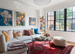
All the molding in this room is new, including the trim on the ceilings, which delineates the space in the same way it does in the dining room. The homeowners’ art collection, rug and pillows bring in lots of cheerful color.
Remember that backsplash half wall in the kitchen? On the family room side, it serves as display space. “It’s a good spot to put a drink or a remote when you’re sitting on the sofa,” Panchapakesan says. “It also brought the wood to this side of the half wall.”
Shop for a sectional sofa
Shop for a sectional sofa
After: The architects and their clients decided that using the addition’s footprint for outdoor living was a better use of space. “Although technically we took away interior space by removing the addition, we were able to use this area in a more meaningful way,” Panchapakesan says. Now the parents can relax, entertain and watch their kids play on the lawn from the new deck.
The two different sizes of slats on the new fence create shadow play and make the structure a design asset.
The two different sizes of slats on the new fence create shadow play and make the structure a design asset.
Across the backyard and alleyway, the homeowners saw the garage door as an opportunity to add colorful artwork. They hired muralist Peru Dyer Jalea to come up with something that would incorporate the names of their children, Maia and Ronen.
After: A new skylight bathes the hall and staircase in light. “We left the original roof joists exposed so that we didn’t have to make structural changes. This saved them a lot on the budget, and they appreciated the idea of exposing the structure,” Panchapakesan says.
Other improvements seen here include the new stair railing, white oak flooring and new trim.
Other improvements seen here include the new stair railing, white oak flooring and new trim.
After: Now the bathroom has marble subway tiles and a marble-look floor. Brass fixtures and a white oak vanity bring in warm contrast.
The wainscoting is composed of green tiles. “These tiles brought in some color and contrast,” Panchapakesan says.
In the bedroom, the bay addition created room for a bench beneath the windows. The window on the left is the new window over the front door.
Check out our beginner’s guide to get started on your home project
Check out our beginner’s guide to get started on your home project
This room also has new trim, including the baseboards, which are cohesive with the rest of the house.
Expanding the storage in the bedroom was also part of the project. “We created a little dressing table dresser on the right to enjoy the new window and to break up the long wall of closets,” Panchapakesan says.
Although they technically wound up with less square footage by removing the back addition, the house now functions much better for the family. The renovation brought in natural light, made the floor plan more functional and created a cozy, family-friendly feel.
More on Houzz
Tour more homes
Hire a local design pro
Shop for your home


House at a Glance
Who lives here: A couple with two young children
Location: Toronto
Size: 1,200 square feet (111 square meters) plus basement; three bedrooms, 2½ bathrooms
Designers: Brian Hagood and Charisma Panchapakesan of CAB Architects (architecture); Garden Party (landscaping)
Contractor: Habitude
Before: The couple’s row house is the one with the tree blocking most of the facade, but Panchapakesan notes that it was almost identical to the one on the right. It had a similar awning, which darkened the room at the front of the house. “Most of the original historic detailing had been removed in the 1960s or 1970s,” she says.
Goals for the project included: