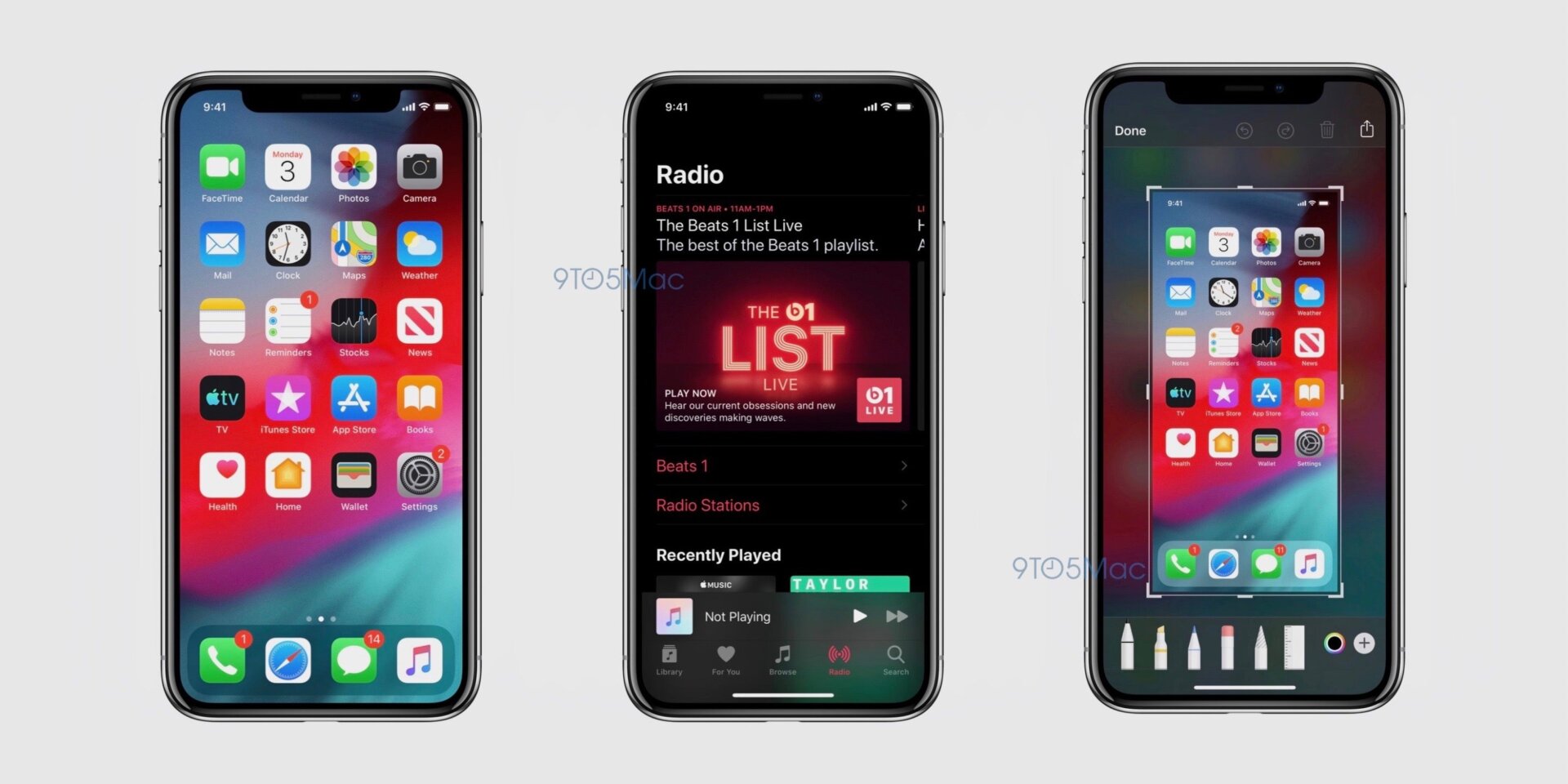
Is it a little shameful that one of the most exciting elements of macOS Mojave was the dark mode option it presented? Probably! Is it as equally shameful that one of the elements of iOS 13 that I’m most excited for is a proper dark mode? Sure! Will that fact dissuade me from being delighted by these screenshots of said dark mode that 9to5Mac got a hold of? Nope.
According to 9to5Mac, the new dark mode will be accessible via Settings or as an option in the control center and while some elements will simply be black instead of white, others get a nice dark blur effect versus the bright white blur effect found now.

This new feature, which is expected to be a part of the years iOS update, iOS 13, will likely be made public at WWDC next Monday. But it won’t be the first time iOS has done something like a dark mode—it will just be the prettiest version.
Currently, iOS has an easy to turn on feature that’s similar to Dark Mode. Go to Settings, General, and then Accessibility. If you scroll down to Display Accommodations and choose Smart Invert then everything that is currently white on an iPhone or iPad will turn black. Other colors will invert as well—notably blue will turn orange. The only things that won’t change color are most images, which will maintain their original hue. (If you choose Classic Invert instead, everything gets inverted and you will be sad by how ugly it all is.)
Smart Invert can’t be toggled on in the Control Center but you can program the power button to turn it on with three quick presses. Which you’ll want to do because Smart Invert is not an ideal dark mode. First, everything is pitch black instead of simply a deep gray as found in most dark modes. So white text on a black field will make your eyes ache just as much as black text on a bright white field.
Second, the inversion of all other colors, particularly the shade of blue closely associated with Apple, makes the operating system feel… kind of cheap and lacking the polished design Apple’s OSes are known for.
And third, it just breaks shit. Got a website or app you’ve already toggled set to dark mode (like Twitter)? Then Smart Invert will invert it to white. Got some images in a website that weren’t tagged properly? Smart Invert will switch those too.
It’s just unattractive and buggy enough to keep it from being usable, even for a dark mode acolyte such as myself. The rumored “real” Dark Mode coming in iOS 13 is consequently very welcome. Even if it is wild that it took it took so long. Windows 10 and macOS both introduced togglable light and dark modes last year, while Google showed off its own dark mode at this year’s Google I/O.


