


Houzz Tour: Designers Make a Couple’s Home Feel New to Them
Instead of moving, these homeowners found pros on Houzz to give their traditional home fresh transitional style

Like many homeowners looking to change homes in the past few years, this Charlotte, North Carolina, couple encountered a very tight and competitive real estate market. Knowing they loved their neighborhood, they decided to stay put and update their home to make it new to them.
They searched Houzz for an interior design firm and found Jena Bula and Darby Tye of Delphinium Design. The design duo took the house from a bit plain and traditional to a look that’s fresh and transitional. The scope of the project included taking the kitchen and bathrooms down to the studs and giving the other rooms a complete cosmetic makeover with new wallpaper, paint, light fixtures, built-ins, furniture and accessories.
They searched Houzz for an interior design firm and found Jena Bula and Darby Tye of Delphinium Design. The design duo took the house from a bit plain and traditional to a look that’s fresh and transitional. The scope of the project included taking the kitchen and bathrooms down to the studs and giving the other rooms a complete cosmetic makeover with new wallpaper, paint, light fixtures, built-ins, furniture and accessories.
After: “The wife loves blues and creams and so do we,” Bula says. The designers added color and texture to the walls with a navy blue grasscloth wallpaper. They kept the homeowners’ antiques and chandelier and had the dining chairs reupholstered in a new fabric to freshen them up.
Other new textiles include a wool rug and custom drapes that have a blue trim tape. “We used high-performance fabrics that would resist stains throughout the house,” Bula says.
They gave the sideboard a more substantial and visually pleasing presence by adding a pair of glass lamps that flank a new mirror. Together, the mirror and lamps lighten up the dark wallpaper.
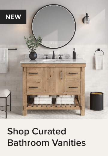
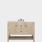
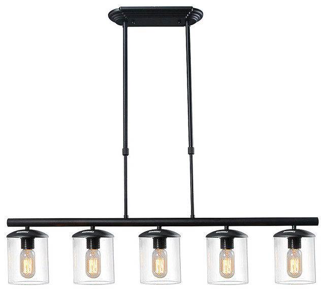
Browse dining chairs in the Houzz Shop
Other new textiles include a wool rug and custom drapes that have a blue trim tape. “We used high-performance fabrics that would resist stains throughout the house,” Bula says.
They gave the sideboard a more substantial and visually pleasing presence by adding a pair of glass lamps that flank a new mirror. Together, the mirror and lamps lighten up the dark wallpaper.
Browse dining chairs in the Houzz Shop
The existing bar was convenient, but it also was a missed design opportunity. The designers remodeled it to include more modern glass cabinet doors and shelves on top. Below, they bookmatched a beautiful quartzite backsplash and countertop, meaning they continued the natural veining pattern from the counter up the backsplash in a seamless way. Below is a wine fridge with French doors.
The hardware is polished nickel. This is a finish the designers used throughout the house to create a cohesive feel from room to room.
The hardware is polished nickel. This is a finish the designers used throughout the house to create a cohesive feel from room to room.
Before: The kitchen was dark and the cabinetry had a heavy and oppressive look. A large perimeter island blocked the flow.
The house had nice hardwood floors, and the designers updated them by having them refinished in a way that took out the more reddish-orange tones.
The house had nice hardwood floors, and the designers updated them by having them refinished in a way that took out the more reddish-orange tones.
After: The new white kitchen is light and bright. The designers used Sherwin-Williams’ Snowbound on the trim and cabinetry and Benjamin Moore’s Edgecomb Gray at 75% throughout the main areas of the house. This means they added 75% of the colorant of that hue to the paint. In other words, they mixed in 25% white paint. “Sometimes if a color is too rich, we will cut it with white and not use the color at full strength,” Bula says.
The Taj Mahal quartzite on the countertops and backsplash adds soft neutral veining patterns to the room. It also brings in a natural material.
Replacing the awkward perimeter island opened up the kitchen. “While we kept the fridge and the range in the same spots, this completely changed the feel and flow of the space,” Bula says. The new island is extra deep at 9 feet by 4 feet, 9 inches. The designers integrated hidden storage in the island. On the seating side, the cabinets are extra long so they can house large platters. Hidden pop-latch hardware conceals these cabinets for a seamless view.
Find a local countertop pro
The hardworking island, which is conveniently located near the fridge and range, includes the kitchen sink, dishwasher and trash-recycling pullout.
The polished nickel faucet has a traditional shape, but its single handle modernizes it. The simple undermount sink has cleaner lines than an apron-front farmhouse sink would have. Also modernizing the look in the kitchen is the backsplash. It’s the same quartzite that Bula used for the countertops.
The polished nickel faucet has a traditional shape, but its single handle modernizes it. The simple undermount sink has cleaner lines than an apron-front farmhouse sink would have. Also modernizing the look in the kitchen is the backsplash. It’s the same quartzite that Bula used for the countertops.
The clear glass of the teardrop pendant lights keeps the view above the island uncluttered. “We fell in love with these oversized pendants. Their polished nickel details tie them to the faucet,” Bula says. Shaker-inspired counter stools nod to tradition but have a more modern look.
The large cabinet on the left of this photo is a pantry cabinet. There’s also a separate pantry. “We designed the pantry cabinet to serve as a drop zone,” Bula says. “It has a charging drawer and a mail station so they can organize things in here rather than cluttering up the counters.”
Behind the cabinet fronts are lots of inserts that were thoughtfully placed. These include rollouts for pots and pans near the stove, sliverware inserts, deep drawers for plastic storage containers and slats for baking sheets.
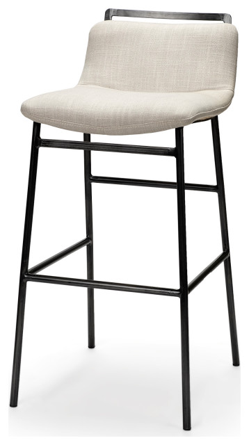
Shop for counter stools
The large cabinet on the left of this photo is a pantry cabinet. There’s also a separate pantry. “We designed the pantry cabinet to serve as a drop zone,” Bula says. “It has a charging drawer and a mail station so they can organize things in here rather than cluttering up the counters.”
Behind the cabinet fronts are lots of inserts that were thoughtfully placed. These include rollouts for pots and pans near the stove, sliverware inserts, deep drawers for plastic storage containers and slats for baking sheets.
Shop for counter stools
At 2⅜ inches, the island’s quartzite countertop is thicker than the perimeter counters’ standard thickness. This gives it a more substantial presence that works well with the island’s large size. It also lends a more modern feel.
Beyond the island, there’s a light-filled eat-in area.
Beyond the island, there’s a light-filled eat-in area.
For the eat-in area, Bula and Tye designed this dining table and had it made by a local craftsperson. It has two leaves and can accommodate 12 people when fully extended. They hung custom pinstriped Roman shades all the way up near the ceiling to make the windows appear taller than they are.
“We love a striped pattern. Custom drapes and upholstery are investments, and stripes are a timeless pattern,” Bula says.
“We love a striped pattern. Custom drapes and upholstery are investments, and stripes are a timeless pattern,” Bula says.
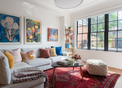
The kitchen opens to the family room, which received a mix of remodeling and cosmetic changes. The designers redesigned the fireplace surround, mantel and hearth, adding quartzite details that match the kitchen. They flanked it with a pair of étagères. “These are wood with woven rattan backs. They add texture in the background,” Bula says.
New artwork also played an important role in the design. The designers visited local gallery Art House Charlotte for a mix of original works and prints. “They have a great selection of work from local artists and up-and-coming artists from all over the United States at good prices,” Bula says.
The rug has an abstract Middle Eastern and floral print. Because this is a high-traffic area, this rug is polypropylene. “With three kids and a dog — and how much they use this room — we needed something durable that could stand up to high traffic,” Bula says.
The coffee table is wrapped in lacquered grasscloth. The designers added a glass top to protect the table from drinks and other wear and tear.
The two chairs in the background are navy with an abstract dotted pattern. “These were actually the jumping-off point for the room,” Bula says. “They swivel so that they can spin them around and talk to people who are in the kitchen.” The round table between them is wood with a marble top.
The two chairs in the background are navy with an abstract dotted pattern. “These were actually the jumping-off point for the room,” Bula says. “They swivel so that they can spin them around and talk to people who are in the kitchen.” The round table between them is wood with a marble top.
Before: The home office had beautiful windows and moldings. But the dark desk felt heavy, the drapes were nothing special and the rug was too small for the space.
After: The walls are the same creamy beige seen in the kitchen and family room. The designers anchored the room in a blue-and-white rug. The new drapes are linen with a Greek key trim tape. “Linen makes for a beautiful drape,” Bula says.
The designers also repurposed two of the clients’ existing spool chairs that had been in the living room and reupholstered them in another striped fabric. “We added this conversation area so that the kids or a spouse could come hang out with whomever was working in here,” Bula says. “It’s my favorite room in the house.”
Before: Architecturally, the bedroom had nice moldings, but the homeowners wanted a softer look.
After: The changes to the primary bedroom were cosmetic and included new furniture, accessories, linens, a rug and window treatments. “The most important thing my clients wanted for their bedroom was for it to exude a calm and relaxing feeling,” Bula says. “We went for a soft and soothing color palette in here. They also love the mountains, so we found a painting of a mountain scene with blues, greens, creams and a little bit of blush in it.”
Paint color in primary bedroom and bathroom: Classic Gray, Benjamin Moore
Paint color in primary bedroom and bathroom: Classic Gray, Benjamin Moore
Soft linens in light colors make the bed inviting. Wood nightstands and woven Roman shades add natural contrast to the lighter tones.
Before: The corner tub in the primary bathroom took up a lot of space. And it didn’t make it easy to open the blinds and let the light in. The rest of the finishes were tired and ready for replacement.
After: “Removing that tub gave us a lot of space,” Bula says. The designers used part of it to expand the shower stall, making it luxuriously roomy. It also got rid of that awkward moment where the vanity bumped right up against the tub surround. Now there’s some breathing room.
The new palette is soft grays, whites and creams. These homeowners were ready for real marble and their designers made sure they were well informed about the choice. “We go over the pros and cons of using marble, as it’s not for everyone,” Bula says. “But they were on board and didn’t mind that it would need to be resealed every year. You can’t beat natural stone, it’s just so elegant.”
The floor tiles are 12-inch marble hexagons, and the 4-inch hexagonal shower floor tiles are the same material for a seamless look. The finish is honed.
Playing off the elegance of the marble, the designers opted for what they call “skinny Shaker” for the cabinet style. This means the rails and stiles are thinner than on typical Shaker-style cabinet door and drawer profiles. “The skinny Shaker style gives it something special,” Bula says.
The hardware is polished nickel. The designers found that adding it to the cabinet doors made things look too busy, so they used hidden pop-latch hardware on the doors. The result is a more streamlined, modern look.
The hardware is polished nickel. The designers found that adding it to the cabinet doors made things look too busy, so they used hidden pop-latch hardware on the doors. The result is a more streamlined, modern look.
Another something special is the thick mitered edge of the marble countertop. Like the kitchen island, it’s 2⅜ inches thick, giving it a strong presence. The faucets also have a strong presence with their extended height and classic Art Deco-inspired silhouettes. The finish is timeless polished nickel.
“We often love to do two bathroom mirrors with three wall sconces. But we changed it up here with one long mirror and sconces overhead,” Bula says. This kept the streamlined aesthetic, and the mirror’s black frame adds contrast to all the light finishes in the room.
New to home remodeling? Learn the basics
Before: An odd extension of the tub surround took away potential shower stall space.
After: With the tub gone, there was room for a luxuriously large shower. The door swings into the area where the tub surround had been. Even with all that space, these homeowners weren’t interested in a permanent shower bench. Bula let them know they could always add an attractive portable teak bench later. She also suggested adding a small niche to make leg shaving safer and easier.
As for tile, the designers used hexagonal marble tile on the floor in a smaller size than the floor tiles. The tight grout lines help prevent slippage. Repeating the hexagon shape created a seamless transition into the shower. The wall tiles are 12-by-6-inch marble subway tiles. “We needed a larger-scale tile because the ceiling in here is high. There simply would have been too many tiles if we’d used standard 3-by-6-inch subway tiles,” Bula says.
The shower head is a rain shower with a handheld wand on a slide bar. This combination keeps the wall uncluttered. The controls are next to the shower door so the couple can turn the water on and wait for it to heat up without getting doused in cold water.
More on Houzz
Tour more homes
Hire a local design pro
Shop for your home


House at a Glance
Who lives here: A couple, their three children and their dog
Location: Charlotte, North Carolina
Size: 3,650 square feet (339 square meters); five bedrooms, 3½ bathrooms
Designers: Jena Bula and Darby Tye of Delphinium Design
Contractor: Watershed Builders
Before: “The house had pretty moldings and was traditional,” Bula says. “We mixed traditional and modern elements without leaning too far in either direction.”
Bula and Tye used Houzz Pro software to keep the project organized. This included creating Mood Boards they could share with their clients, invoicing and keeping track of selections. “It’s great because a client can come to me years later and say, ‘Can you get me another one of those lamps?’ and I can find it right away for them,” Bula says.
The dining room had great bones, including wainscoting, a beautiful crystal chandelier and a dry bar. Also, the family had a lovely antique dining table, chairs and sideboard. The room just needed an update and a more pulled-together look.
Find an interior designer on Houzz